

A proper UX competitor analysis is about much more than a simple feature checklist. It is a strategic deep dive into how a rival’s digital experience makes users feel and act.
You are looking for the friction in their booking forms, lead funnels and sign up flows. The small hurdles that create frustration and cause people to abandon the process. Uncovering those weaknesses gives you a direct, actionable roadmap for improving conversions, bookings and lead quality on your own website.
Go Beyond a Simple Feature Checklist
Most competitor analyses are skin deep. They end up as a spreadsheet listing features, pricing and messaging. That has its place, but it misses the most critical element influencing a customer’s decision: the user experience.
A feature list will not tell you why a potential customer chose them over you. It will not explain why they abandoned a booking halfway through. A true UX focused analysis is about the journey, not just the destination.
• For tourism operators, it means getting granular with the booking calendar and checkout.
• For professional service firms, it is about the clarity and ease of the enquiry form.
• For SaaS businesses, it is about the value a user sees during trial sign up and early onboarding.
From Features to Friction
Instead of asking, “What features do they have?” start asking, “Where do their users get stuck?”
This shift stops you chasing feature parity and pushes you to create a smoother, more valuable experience.
Common friction points you will see again and again:
• Ambiguous calls to action
Vague buttons like “Submit” or “Continue” do not set expectations. Users hesitate, which hurts conversions and lead quality.
• Confusing navigation
Menus and labels that do not match how users think force them to hunt for basic information and often give up.
• Clunky forms
Asking for too much information too early is a classic mistake that kills booking and lead form completion.
• Inconsistent messaging
When the promise made in an ad does not match the landing page, trust erodes and bounce rates spike.
It helps to see the difference in mindset side by side.
Traditional vs UX-Focused Competitor Analysis
This table shows the shift from an outdated, feature-based view to a modern, conversion-focused one grounded in UX and CRO best practice.
Understanding these emotional triggers and roadblocks gives you a direct path to improving your own conversion rates. This isn’t just about tweaking design; it's a strategic business decision that directly impacts lead quality and revenue. After all, your process for identifying these issues is often more important than the website itself, a concept we dive into in our guide on why your website isn't the problem — your process is.
The goal isn't to copy your competitors. It's to understand the established user expectations in your market, identify where competitors fail to meet those expectations, and then build an experience that becomes your own competitive advantage.
This deep dive into user experience is exactly why the global UX services market is set to explode, growing from $30.20 billion in 2024 to an expected $182.32 billion by 2032. As this growth shows, businesses are finally waking up to the fact that UX is a critical driver for customer satisfaction and retention. You can learn more about the rapid growth of the UX services market on Fortune Business Insights.
Assemble Your UX Investigation Toolkit
A good competitor analysis isn't about aimless browsing. It’s a structured investigation, and you need the right tools and a clear plan of attack before you dive in.
Your first job is to identify who you're actually analysing. Don't just pick your top three rivals from a Google search. A strong analysis pulls insights from a mix of players, giving you a much better feel for what users actually expect and where the clever ideas are hiding.
I always recommend looking at three types:
Direct Competitors: These are the obvious ones. They offer a near-identical service to the same people you do. If you run a boutique hotel in Queenstown, this is the hotel across the street. You’re both fighting for the exact same customer.
Indirect Competitors: These businesses solve the same core problem, just in a different way. For that same hotel, an indirect competitor might be a high-end Airbnb or a premium tour company that bundles accommodation into its packages.
Aspirational Competitors: These are the companies everyone raves about for their world-class user experience, even if they're in a totally different industry. A SaaS company could learn a ton from how Shopify nails its onboarding, just as a tourism operator might study an airline's seamless checkout flow.
Identify the User Journeys That Matter Most
Once you have your list of companies, narrow your focus to the specific user flows that directly impact the bottom line. Trying to analyse an entire website is a waste of time. Instead, lock in on the critical paths that lead straight to a conversion.
For a professional services firm, this is almost always the "Request a Quote" or "Contact Us" journey.
For a tourism operator, it’s the booking process—from selecting dates all the way through to payment.
And for a SaaS business, it’s the trial sign-up and initial onboarding flow.
By zeroing in on these high-stakes interactions, you guarantee your findings will be directly tied to growing revenue.
This visual shows how the process moves from just ticking off features to finding real user friction, which is where the opportunities for growth truly lie.
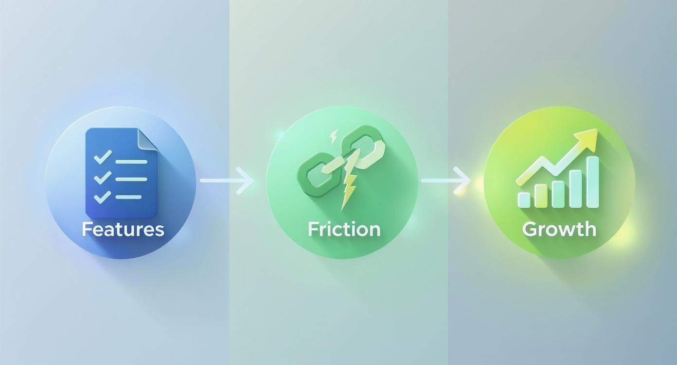
The big takeaway here is that growth doesn't come from piling on more features. It comes from systematically removing the friction that stops people from seeing the value you already offer.
Curate Your Set of Essential Tools
With your targets and journeys locked in, it's time to tool up. You can find a lot just by looking, but the right tools give you objective data that strips the guesswork out of your analysis.
The goal isn't just to form an opinion about a competitor's site. It's to gather evidence of what works, what doesn't, and—most importantly—why.
Your toolkit should be a mix of qualitative and quantitative gear:
Screen & Session Recording Software: Tools like Loom or Vidyard are gold. You can record yourself going through key tasks on a competitor's site, talking through your thoughts as you go. It lets you flag friction points, capture bugs, or point out confusing UI in the moment. It's a simple way to build a powerful video log of your investigation.
Behaviour Analytics Tools: You can't put Hotjar or Microsoft Clarity on someone else's website, but you can use them on your own to see where your users are getting stuck. Once you know the common patterns on your site, you can look at how competitors solve those same issues. If your heatmaps show everyone ignoring a key call-to-action, you can analyse how a competitor makes their primary CTA impossible to miss.
Performance & Tech Stack Analysers: Browser extensions like Wappalyzer or BuiltWith show you the tech a competitor is using. This can offer clues about their analytics, A/B testing platforms, or CRM. On top of that, running their site through Google's PageSpeed Insights tells you how their performance stacks up against yours. A slow, clunky booking engine is a notorious conversion killer.
A Simple Spreadsheet or Database: The final piece of your kit is a well-organised spreadsheet or a Notion database. This is where you'll log everything—screenshots, video links, and notes—all categorised by competitor and user journey. This central hub is what you’ll use to spot patterns and eventually build your CRO roadmap.
Uncover Friction in Competitor User Journeys
Now for the practical part: getting your hands dirty. We're moving from planning to practice, walking through your competitors’ key user flows to find exactly where things get clunky, frustrating, and ultimately, where they lose customers.
This isn't about gut feelings or personal preference. It's about applying a critical lens and methodically dissecting the experience. You'll be using established UX principles to spot the weaknesses their own team has likely overlooked.

Apply a Heuristic Lens
A heuristic evaluation sounds technical, but it’s really just a practical way of judging an interface against a checklist of recognised usability principles. The gold standard here is Jakob Nielsen's 10 Usability Heuristics—they've been a cornerstone of good UX for decades.
You don't need a PhD in human-computer interaction to use them. Just think of them as a cheat sheet for spotting common design flaws that trip users up and kill conversions.
Take Nielsen's "Error prevention" heuristic. A good design doesn't just provide helpful error messages; it prevents the user from making a mistake in the first place. When you're analysing a competitor's booking form, you're not just looking at the fields. You're asking questions like:
Does their date-picker let me book a tour for last Tuesday? That's a classic failure of error prevention that leads to failed bookings.
Is the phone number format ambiguous? If I don't know whether to add a country code, I'm more likely to hit a validation error and give up.
Are there clear constraints, or is it a free-for-all that practically invites mistakes?
Every single time a user hits an error, friction is added. Enough of those moments, and they'll just abandon the process. This is a huge part of learning how to find and fix the real conversion killers on your website, even when you're looking at someone else's turf.
Document What You See, Not What You Think
As you go through these user journeys, your screen recorder and spreadsheet are your best friends. The aim is to capture both the good and the bad with screenshots and quick, punchy notes.
A vague note like "Bad form design" is useless. Instead, get specific and make it actionable:
Finding: Competitor A's quote form has 12 fields on the first screen, including 'Annual Turnover'. This creates high cognitive load and will likely scare off early-stage prospects who don't have that figure ready.
Screenshot: [Image of the long, intimidating form]
Heuristic Violated: Recognition rather than recall (making users think and work way too hard).
This level of detail is what makes the whole exercise worthwhile. It turns abstract principles into a concrete library of examples you can point to when it's time to improve your own site. You're literally building a visual playbook of what to do—and what to avoid at all costs.
Common Conversion-Killing Friction Points to Look For
While heuristics provide a solid framework, some problems pop up again and again in booking and lead-gen funnels. As you conduct your competitors analysis UX, keep a sharp eye out for these all-too-common conversion blockers.
Weak Information Scent: Does the button text accurately predict what's on the next page? If a button says "See Our Plans" but dumps you on a generic contact form, the scent is broken. That erodes trust instantly.
Cumbersome Forms: Is it one giant, intimidating wall of text fields? Or do they chunk information into logical steps and use sensible defaults? The former is a known engagement killer that directly harms lead quality.
Vague Calls-to-Action (CTAs): A button that just says "Submit" is a massive missed opportunity. Compare that to a competitor whose button reads "Get My Free Quote." One is a command, the other is a benefit. The second one always wins.
Inconsistent Messaging: Does the promise on their Google Ad or homepage match the reality of the landing page? If the messaging suddenly shifts, it creates cognitive dissonance and makes users feel like they've been misled.
By meticulously documenting these friction points, you’re not just critiquing a competitor. You're gathering the raw intelligence needed to build a demonstrably better, higher-converting experience for your own customers.
Analyse the Visual Language of Competitors
First impressions form quickly. A cluttered or untrustworthy interface can lose a customer before they read a single line of copy.
Deconstruct the visual hierarchy
Ask:
Where does my eye go first?
Is the primary CTA obvious?
Are headings and content clearly differentiated?
Does the primary button stand out from secondary actions?
A weak visual hierarchy forces users to think too hard. That extra mental load shows up as hesitation and drop offs.
Evaluate clarity and consistency
Look across the key funnel pages:
Typography
Is the text readable on desktop and mobile? Are headings, subheadings and body text used consistently?
Colour palette
Is there a clear logic for primary, secondary and alert colours?
UI elements
Do buttons, inputs and links behave the same way throughout the journey?
Consistent design reduces cognitive load and builds trust, which matters when someone is about to pay or share sensitive information.
Consider the feel, not just the look
Interaction feedback matters. Buttons that do not change state on hover or tap, loading states that are invisible, or forms that fail silently all chip away at user confidence.
When you document these patterns you are not just judging aesthetics. You are gathering ideas for how to make your own interface feel more reliable and professional.
Evaluate Clarity and Consistency
Clarity and consistency are the quiet workhorses of a great user interface. They build trust by making the experience feel predictable and easy. When they're missing, the user experience feels disjointed and amateurish—a huge red flag for anyone about to enter their payment details.
Look for consistency across their key pages, especially in the booking funnel or signup process.
Typography: Can you actually read the text? Are they using a clear, modern font at a readable size (usually at least 16px for body copy)? Are font weights used logically to separate headings from paragraphs? Low-contrast text is a classic mistake that not only fails accessibility standards but also signals a lack of attention to detail.
Colour Palette: Is there a clear logic to their colours? For instance, is one colour always used for primary actions, another for secondary ones, and a third for alerts? When colours are used inconsistently, the interface becomes confusing.
UI Elements: Do buttons, forms, and icons look and behave the same way everywhere? If a button looks different on every page, it forces the user to re-learn the interface at every single step. That's a textbook source of friction.
Key Takeaway: A consistent design language reduces the user's mental workload. When people don't have to guess what an element does, they can focus on their actual goal—like booking that tour or signing up for your trial.
The Psychology of Interaction Design
Beyond the static visuals, pay close attention to how their interface feels to use. This is where you connect specific UI choices to their likely impact on user confidence. For example, what happens when you interact with their buttons and forms? A button that doesn't change state on hover or click (known as providing visual feedback) can make users wonder if the site even registered their action. This tiny moment of hesitation can be enough to break the flow.
The global User Interface Design Market is projected to hit $2.79 billion in 2025 and is expected to soar to $9.83 billion by 2035. This boom is driven by the clear link between a polished interface and commercial success. You can discover more insights about the UI design market surge and what's behind it.
By systematically documenting these visual and interactive elements, you’re not just making a list of likes and dislikes. You're building an evidence-based roadmap for improving your own website's design and conversion rate.
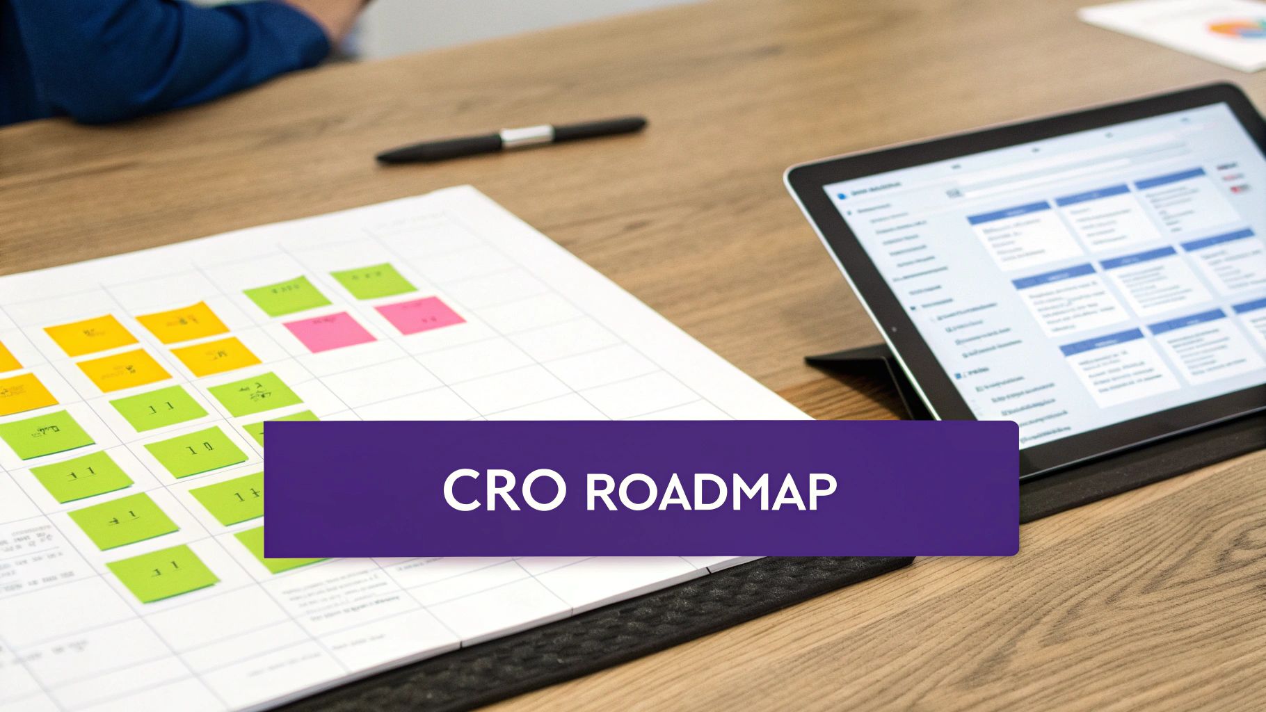
Turn Your Findings into a CRO Roadmap
You've done the hard work. Your analysis is packed with screenshots, notes, and a long list of friction points you've spotted on your competitors' sites. This is gold, but raw intelligence is useless without a plan.
The next step is to translate those findings into a prioritised conversion rate optimisation (CRO) roadmap. Insights without a strategy are just interesting observations. A roadmap turns them into a series of focused experiments designed to get you real business results—more bookings, better leads, or a jump in trial sign-ups.
Prioritise Opportunities with a Simple Framework
You can't fix everything at once. The real skill is focusing your resources on the changes most likely to move the needle. A simple prioritisation framework brings objectivity to the process and stops you from chasing low-impact tweaks.
One of the most effective methods is the ICE score, which stands for:
Impact: How much will this change improve our main metric (e.g., conversion rate, lead quality)?
Confidence: How sure are we that this change will deliver the expected impact, based on UX best practice and our own data?
Ease: How simple is this to implement, both technically and operationally?
Score each idea from 1 to 10 for each category, then multiply them to get a final priority score. It’s a simple but powerful exercise that forces you to think critically about every potential change.
Scenario: "Our competitor's lead form auto-fills company data using an API, while ours is manual. The potential Impact is huge (9/10), our Confidence is high based on established UX best practices (9/10), and the Ease is medium due to development costs (5/10). This gives it a priority score of 405."
This calculation instantly surfaces the quick wins and high-leverage projects, giving you a logical sequence for your testing plan.
Example UX Prioritisation Matrix
As you can see, the simplified booking form stands out as the highest-leverage opportunity, even though it's not the easiest to implement. This is the clarity a good framework provides.
From Analysis to Actionable Hypotheses
Each prioritised idea now needs to be framed as a testable hypothesis. This structure is what separates a professional CRO programme from a team just throwing fixes at the wall. A solid hypothesis isn't a vague idea; it's a specific, measurable statement about what you expect to happen.
Here’s a practical structure:
Because we saw [Observation from competitor analysis]...
We believe that [Proposed change] for [Target audience]...
Will result in [Expected outcome]...
We'll measure this with [Key metric].
Example: "Because we saw that our top competitor uses a two-step checkout that reduces form fields on the first screen, we believe that simplifying our own booking form for mobile users will result in a higher checkout completion rate. We'll measure this with a 10% increase in successful bookings on mobile devices."
This approach transforms your analysis from a critique of other sites into a forward-looking strategy for your own growth. Remember, conversion rate optimisation is broken if it's treated as a list of one-off changes instead of a continuous learning process.
Secure Stakeholder Buy-In
Finally, you need to present your findings and proposed roadmap to your stakeholders. This is where your detailed competitor research becomes your most powerful tool for persuasion.
Instead of just saying, "We should improve our forms," you can now walk into the room and say:
"Our top three competitors all use multi-step forms that break the process into manageable chunks. Our single, long-form page is an outdated pattern, and our analytics confirm it has a 45% abandonment rate. We hypothesise that adopting a similar multi-step approach will reduce friction and lift our lead submissions."
Presenting evidence from your competitors analysis UX provides context and creates urgency. It shows you’re not just chasing trends but responding to established user expectations in your market. This evidence-based approach makes it far easier to get the budget and resources you need to turn that roadmap into reality.
A Final Thought: This Isn’t About Copying Your Rivals
Let's be clear: the goal here isn't to clone your competitors' features or copy their design. The real prize is a deep understanding of the established user expectations in your market. Your analysis reveals the baseline—the common patterns and flows users now see as standard.
Your job is to pinpoint where your rivals fail to meet these expectations and, in doing so, create friction. Those weaknesses are your opportunities.
By obsessively focusing on your users and what they’re trying to achieve, you can build a digital journey that’s so much better it becomes your unfair advantage. This is how you stop competing on features or price and start competing on experience.
A superior experience doesn't just convert better today; it builds the kind of loyalty that keeps customers coming back. It’s what turns a one-time booking into a repeat customer and a trial sign-up into a long-term advocate for your business. That’s the real ROI of a well-executed UX analysis.
Ready to find the conversion gaps on your own website and build a real competitive edge?
Request your free UX Snapshot today and get actionable insights from our team.
Common Questions About UX Competitor Analysis
Here are straight-up answers to the questions we hear most often from marketing leaders and product teams.
How Often Should We Do This?
A full-blown, deep-dive analysis is a serious undertaking, best saved for big moments like a website redesign or entering a new market.
For ongoing intelligence, I recommend a lighter, quarterly review of your top two or three direct competitors. This keeps you on top of any new features, messaging shifts, or tweaks to their checkout or lead gen flows. Think of it as ongoing market intel—it stops you from getting blindsided.
What’s the Difference Between a UX Audit and a Competitor Analysis?
This is a critical distinction. They use similar skills, but their focus is completely different.
A UX audit is an internal investigation. You’re using analytics, heatmaps, and user testing on your own website to find out where your users are getting stuck. The goal is to plug the leaks in your own funnel.
A competitor analysis looks outward. You’re dissecting other companies' websites to understand the competitive landscape, spot their weaknesses, and find strategic openings for your business.
A smart CRO strategy needs both. The competitor analysis tells you where the market is headed, while the UX audit tells you what’s broken on your own vehicle.
How Do I Analyse a Competitor's Mobile App?
You can’t use browser-based tools for a mobile app, so the approach has to be different, but the core principles are the same.
Grab your phone and screen-record yourself using the competitor's app. Work your way through their main user flows—signing up, buying something, or completing a key action. As you go, narrate your thoughts out loud, calling out moments of frustration or things that work surprisingly well.
Keep an eye out for app-specific usability issues:
Navigation: Is the menu easy to find and use with one thumb?
Performance: Does the app feel quick and responsive, or does it lag and glitch?
Onboarding: How fast do they get a new user to the "aha!" moment?
This hands-on testing is the quickest way to uncover the good, the bad, and the ugly of their mobile experience.
Uncovering these insights is just the starting line. The real work is turning them into a high-impact CRO strategy that actually grows your bookings and leads.
Ready to find the hidden conversion gaps on your own website? Request your free UX Snapshot today and get actionable insights from our team.
We will walk through your key journeys, highlight the friction points holding you back, and give you a clear, prioritised list of improvements you can act on straight away.

Subscribe to our newsletter
Stop losing bookings, get insider tips to turn your website into a conversion machine.
More posts
Insights to help you turn more visitors into bookings, through better SEO, UX, and conversion strategy.

Customer journey mapping for bookings and enquiries (practical guide)

Marketing for B2B: A Modern Playbook for High-Growth
How Strategy and Branding Drives Conversions for NZ Businesses