
Your strategy is the ‘why’ behind what you do. Your branding is ‘how’ you tell people about it. When there’s a gap between that promise and the actual experience on your website, you leak revenue, bookings, and qualified leads.
It’s like walking into a luxury hotel with a stunning lobby, only to find the check-in queue is chaotic and your room key doesn't work. The promise doesn't match the reality. This disconnect between brand strategy and user experience (UX) is where conversions die.
Why Your Strategy and Branding Aren't Converting Visitors

Many businesses invest heavily in a sharp brand identity and a solid commercial strategy but fail to connect those dots online. The result is a website that looks the part but doesn't turn visitors into customers. That gulf between what you promise and what you deliver digitally is precisely where revenue vanishes.
Take a boutique NZ tourism operator branding themselves as the provider of exclusive, seamless adventures. If their website’s booking engine is a clunky, confusing mess that crashes on mobile, the user experience shatters the brand promise. That friction creates doubt, sending potential customers straight to competitors.
The Commercial Cost of a Disconnected Experience
A poor user experience isn’t a minor frustration; it’s a direct hit to your bottom line. Every confusing navigation menu, vague call-to-action, or slow-loading page actively works against your business goals. Heatmaps and session recordings tell this story clearly—visitors clicking non-clickable elements or abandoning forms halfway through.
This disconnect shows up in costly ways across different industries:
SaaS Companies: Your brand promises "effortless productivity," but the trial sign-up is so clunky that users drop off before seeing the product. This directly impacts trial-to-paid conversion rates.
Professional Services: A law firm builds its brand on trust and authority, but its website has broken links and a confusing contact process, killing qualified leads before they even start.
Tourism Operators: A hotel advertising "ultimate relaxation" loses all credibility with a booking system that takes too many steps, causing up to 45% of users to abandon their reservation.
A common mistake is treating your website as a digital brochure instead of your hardest-working sales tool. Your strategy and branding must be woven into every functional aspect of the user journey to guide visitors toward conversion.
Ultimately, your brand isn't what you say it is—it's what your customers experience. If your website fails to deliver on your promises, your marketing spend is wasted. For a deeper look, it's worth understanding why your marketing might be stuck. Aligning your user experience with your core brand strategy is the first step to fixing the leaks in your conversion funnel.
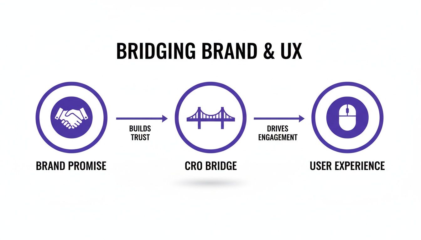
Bridging The Gap: How UX Delivers on Your Brand Promise
Your brand makes a promise. Your website’s user experience is where you either deliver on it or break it. Every interaction—from page load speed to form simplicity—tells a story about your brand and becomes a moment of truth.
A strong brand might promise efficiency, trust, and quality. But a clunky, slow, or confusing website sends the opposite message. That functional reality erodes the trust you’ve spent years building, becoming a major barrier to bookings, qualified leads, and sales.
Your Website Is The Brand Experience
It’s a massive mistake to treat your website as separate from your brand. For most customers, your website is the first, and often only, experience they have with you. The design, the messaging, and its functionality must all work together to reinforce what you stand for.
Consider these common disconnects that kill brand perception and leak revenue:
SaaS Example: A company pitches itself as "effortlessly simple," but its sign-up process is a maze of technical jargon and unnecessary steps. Heatmaps often show users rage-clicking in confusion right before abandoning their trial.
Tourism Example: A luxury travel operator promises "seamless relaxation," yet its booking form is a multi-step nightmare that times out on mobile. The customer’s frustration directly undermines the promise of a stress-free holiday.
Services Example: A professional services firm talks about authority and expertise, but its website navigation is a mess, making it impossible to find case studies or contact details. The impression isn't expertise; it's disorganisation.
These aren't just technical problems; they are brand failures. Each point of friction creates doubt and tells your customer you don't value their time.
How CRO Turns Brand Values Into Revenue
This is where Conversion Rate Optimisation (CRO) becomes critical. It’s the practical, data-driven bridge connecting your brand promise with the user's actual experience. It’s a systematic way to ensure the customer journey is a true reflection of your brand’s values.
CRO isn't about guessing which button colour works best. It's a process of finding and removing friction.
The core idea behind CRO is simple: make it as easy as possible for someone who wants what you offer to become a customer. When your website’s functionality aligns with your brand’s promises, you create a clear path to conversion.
This process is built on real data from analytics, heatmaps, and session recordings, not guesswork. A UX audit might reveal that 70% of your mobile visitors abandon the booking form at the payment stage. That's not just a lost sale—it's a broken promise of a simple and secure transaction.
Fixing these issues does more than lift a metric; it reinforces your brand. A fast, intuitive booking process doesn't just increase conversions—it proves your tourism brand is efficient and cares about its customers' time. A clear, helpful onboarding flow for a SaaS product doesn't just reduce churn—it delivers on the promise of simplicity. By systematically improving the customer journey, you learn more about the critical aspects of user experience optimisation and how it directly drives commercial success.
Diagnosing Conversion Leaks With A Brand-Led UX Audit
You have a brand strategy and a website, but often, they live in different postcodes. When your brand promises one thing and your website delivers another, you create friction that costs you money.
A brand-led UX audit is a diagnostic tool to pinpoint exactly where the experience you promise and the experience you deliver don't align. This isn't about a full redesign; it’s about targeted, data-backed fixes that plug the leaks in your revenue pipeline.
We’ll analyse your site through three commercial lenses: Clarity, Credibility, and Simplicity. Asking the right questions here will uncover the friction points killing your bookings, trials, and qualified leads.
Pillar 1: Clarity
Clarity is about speed: how fast does a visitor get it? If they can't figure out what you do, who you're for, and why they should care within seconds, they're gone.
Check your Google Analytics. A high bounce rate (over 60%) on a key landing page is a massive red flag, suggesting visitors arrive and immediately think, "Nope, not for me." Likewise, a low average time on page means they aren’t engaged enough to understand your offer.
Without a strategic CRO bridge connecting your brand promise to the user’s experience, your marketing messages become empty words, leaving visitors confused and unconvinced.
Pillar 2: Credibility
Credibility is about trust. Your brand can shout about its expertise, but if your website looks unprofessional or offers zero proof, that trust vanishes.
Common credibility killers include:
Generic Stock Photos: Your professional services firm looks anything but authoritative when using the same tired stock photos as your competitors.
Hidden or Outdated Testimonials: Making visitors hunt for reviews is a bad look. For tourism operators, if social proof isn't front and centre, people assume you have none.
Unclear Pricing or Process: A SaaS company with a confusing pricing page creates immediate suspicion, sending potential customers to competitors.
Every element on your site either builds trust or erodes it. A professional design, easy-to-find contact information, and real customer reviews are non-negotiable conversion assets.
Pillar 3: Simplicity
Finally, there’s simplicity. How much effort is required to book a tour, start a trial, or get in touch? Every extra click, confusing step, or unnecessary form field adds friction—the enemy of conversion.
Heatmaps and session recordings are brilliant for auditing simplicity. Heatmaps can show users clicking on non-clickable elements, a clear sign of a confusing layout. Session recordings let you watch users get stuck in your booking funnel or abandon a sign-up form out of frustration. It's also worth running a competitor analysis in UX to benchmark your user journey.
The numbers don’t lie. Global e-commerce conversion rates sit between 2.5% and 3%. This proves that even a small reduction in friction can have a massive impact on your bottom line. Dive deeper into these numbers with these CRO statistics on Shopify.com.
Brand-Led UX Audit Checklist
Use this checklist to self-audit your website and quickly identify common friction points where your brand promise and user experience fall out of sync.
Running through these questions provides a clear picture of what is broken and why, giving you a prioritised action plan for growth.
Real-World Examples: Strategy and Branding in Action
Theory is useful, but commercial results are better. Let's look at how NZ businesses in tourism, SaaS, and professional services have aligned their brand strategy with UX to drive measurable growth.
Each example unpacks a common problem, the brand-aligned UX fix that solved it, and the commercial results that followed.

These are not cosmetic touch-ups. They are strategic moves designed to align the customer's journey with the brand's promise, directly impacting leads and sales.
NZ Tourism: Increasing Mobile Bookings for an Adventure Operator
A Queenstown adventure tourism operator built its brand on thrilling, high-end experiences, targeting international tourists seeking premium tours.
The Problem: Analytics showed a huge drop-off during mobile checkout. While the desktop site performed adequately, over 60% of mobile users abandoned their booking at the payment stage. Heatmaps confirmed the culprit: users were frustrated by tiny form fields and a clunky calendar widget. The experience felt cheap, completely undermining their brand promise of a seamless adventure.
The Brand-Aligned UX Solution: The mobile booking flow was streamlined into three simple steps. Generic stock photos were replaced with high-quality images of real customers on their tours, boosting social proof. Crucially, the payment form was redesigned with large, easy-to-tap buttons and auto-fill options, making it effortless to complete.
The Commercial Outcome: Within two months, mobile bookings shot up by 28%. This wasn't just a technical fix; it rebuilt brand credibility at the most critical moment, turning excitement into revenue. It's a key reason why most tourism websites lose bookings in the first 8 seconds.
SaaS: Reducing Trial Abandonment for a B2B Software Company
A Wellington-based SaaS company sold a project management tool with a core brand promise of "effortless integration and simplicity." Their strategy hinged on converting free trial users into paying subscribers.
The Problem: User session recordings revealed a painful truth: a huge number of trial users logged in once and never returned. The onboarding process dumped them into a blank dashboard with zero guidance, instantly shattering the "effortless" promise and causing a massive trial abandonment rate.
The Brand-Aligned UX Solution: They completely overhauled the onboarding experience. New users were greeted with a checklist-style tutorial that walked them through setting up their first project. They also added pre-filled templates and short video explainers at key moments, proving the software's value in under five minutes.
The Commercial Outcome: The new flow delivered a 40% increase in user activation (completing key initial tasks) and a 15% lift in their trial-to-paid conversion rate. By making the first five minutes of the user experience reflect their brand promise, they slashed churn and grew monthly recurring revenue.
Your onboarding isn't just a feature; it's the first and most critical delivery of your brand promise. A confusing first five minutes can undo months of expensive marketing.
Professional Services: Generating Qualified Leads for a Consulting Firm
An Auckland-based financial consulting firm branded itself as trustworthy, expert, and approachable, aiming to attract high-value corporate clients via its website.
The Problem: The site had plenty of traffic, but the contact form attracted spam and low-quality leads. Generic stock photos of boardrooms and a lack of process clarity made them look just like every other firm, failing to build trust.
The Brand-Aligned UX Solution: Stock photos were replaced with professional headshots of their actual consulting team, instantly humanising the brand. They also created a dedicated "Our Process" page with a clear infographic, demystifying their services and setting client expectations.
The Commercial Outcome: These changes resulted in a 50% increase in qualified leads within three months. By showing their real team and being transparent about their process, they built trust before the first call, attracting the exact clients their strategy targeted.
Using Personalisation to Reinforce Your Brand Strategy
Modern branding is about making your customers feel seen and understood. The days of shouting a generic, one-size-fits-all message are over. Today, personalisation isn’t just a nice-to-have; it's a core part of any branding strategy that actually works to drive conversions. It’s the difference between blasting a message to a crowd and having a meaningful, one-to-one conversation.
This goes beyond slotting a first name into an email. Real personalisation uses behavioural data—past bookings, browsed services, or content downloads—to deliver relevant communication that reinforces why your brand is the right choice for them.
Turning Data Into Brand Loyalty and Revenue
A brand that personalises its communication feels more attentive and valuable, building trust and fostering long-term relationships that directly impact your bottom line.
For a Tourism Operator: Instead of a generic newsletter, send a targeted email to a customer who booked a family adventure last year, showing them a new family-friendly package. This demonstrates you remember them, making a repeat booking far more likely.
For a SaaS Business: A new user signs up for a trial to explore your project management features. Your onboarding emails should focus on that workflow, with tips and case studies that prove value for their specific role, turning trial users into paying customers.
For Professional Services: Someone downloads your whitepaper on financial planning for small businesses. You follow up with content about succession planning, positioning your firm as an expert partner on their specific business journey.
Personalisation is the operational side of empathy. It’s using data to show customers you’re paying attention, which makes them pay attention to you. This is how you turn fleeting interest into sustained engagement and commercial loyalty.
The Commercial Power Of Segmented Communication
Segmented email marketing allows you to deliver tailored messages with precision, constantly reinforcing your brand’s relevance and nurturing leads with information they actually want.
In 2024, a standard personalised email campaign in NZ saw a respectable 25% open rate. But segmented campaigns—tailored to specific customer groups—achieved a 39% open rate. That’s a 14% lift in engagement, a massive indicator of its branding and commercial impact.
By investing in personalisation, you embed your brand as a relevant, indispensable partner in your customer’s world. To dig deeper, check out these powerful website personalization strategies for SaaS.
An Actionable Roadmap to Align Strategy, Branding, and UX
You've defined your strategy and brand. Now, how do you turn those ideas into results? A clear, prioritised roadmap prevents analysis paralysis and builds momentum. The goal isn't to fix everything at once; it's to score quick, measurable wins that prove the value of aligning your strategy and branding with user experience.
This simple, three-phase process moves from measurement to targeted experiments, ensuring every action is data-backed and aimed at a commercial outcome: Measure, Diagnose, and Experiment.
Phase 1: Measure What Matters
You can't fix what you don't measure. Before touching a single headline or button, you must have reliable data. This step ensures you can accurately see how your changes impact bookings, leads, or sales.
- Action Step: Run an analytics audit. Open Google Analytics 4 and verify that your goals, events, and conversion funnels are set up correctly. Are you really tracking form submissions, booking starts, and demo requests accurately? Skipping this means you're flying blind.
Phase 2: Diagnose The Friction
With measurement locked in, it’s time to find the specific friction points killing your conversions. This is where you connect analytics data with actual user behaviour to uncover the "why" behind drop-offs.
- Action Step: Install user behaviour tools. Use heatmaps to see where people click and scroll—you'll quickly spot confusing layouts or ignored CTAs. Better yet, use session recording software to watch real users try to navigate your site. Pay close attention to critical flows like checkout or sign-up forms to see their frustration firsthand.
A classic mistake is jumping straight into A/B testing random elements like button colours. Always diagnose first. Watching just five user recordings will give you more actionable insights about brand-experience disconnects than a month of guesswork ever will.
Phase 3: Experiment For Growth
Now you can experiment with confidence. Armed with data-backed ideas from your diagnosis, you can run targeted tests on the areas you know are causing problems. Focus on changes that directly solve the friction you observed.
- Action Step: Kick off with high-impact A/B tests. Start with the big levers: your homepage headline, the primary call-to-action on service pages, and the first few fields in your lead form. These areas almost always deliver the biggest lifts in conversion.
This cycle of measuring, diagnosing, and experimenting is the engine that drives sustainable growth. Research shows that only 10% of Kiwi companies prioritise understanding their customer acquisition funnel. Adopting a structured optimisation framework provides a significant competitive advantage. You can discover more insights from the Market Measures report.
Common Questions About Strategy, Branding, and UX
Tying business goals, brand identity, and conversion together raises a few common questions. Here are the most frequent ones we hear, with practical answers.
How Can I Align Brand And UX On A Small Budget?
You don’t need a massive budget. Some of the most powerful insights come from low-cost activities. First, get your data sorted. Install free tools like Google Analytics and a heatmap tool with a free plan. This gives you a window into user behaviour without costing a cent. Next, run five simple user tests. Ask people who fit your target audience (but not your staff) to complete one critical task on your website, like finding your phone number or booking a service. Watch where they hesitate—those moments are pure gold.
What Is The Difference Between UX And UI?
This distinction is crucial. Imagine you're building a house:
UI (User Interface) is the look and feel—the paint colour, furniture style, and light fittings. It’s the visual aesthetic.
UX (User Experience) is the architectural blueprint—the floor plan. Does the layout work? Can you get from the kitchen to the dining room easily?
A beautiful UI on top of a confusing UX is like a stunningly decorated house with a terrible layout—it looks amazing but is a nightmare to live in. A polished UI builds brand credibility, but a thoughtful UX drives action.
How Do I Measure The ROI Of Better Branding And UX?
Track the commercial metrics that matter before and after you make changes. The most obvious indicator is your conversion rate on key goals—form submissions, trial sign-ups, or completed bookings. Also, look at engagement metrics like a lower bounce rate on important landing pages and an increase in average session duration. For service-based businesses, a key indicator is the quality of incoming leads. If you get more enquiries from project-ready clients after clarifying your website’s message, that’s a direct return on your investment in better strategy and branding.
Your brand promise is only as strong as the experience you deliver. Our UX Snapshot uncovers your most critical conversion gaps fast, providing a clear, actionable roadmap to turn more visitors into customers. Get started today.

Subscribe to our newsletter
Stop losing bookings, get insider tips to turn your website into a conversion machine.
More posts
Insights to help you turn more visitors into bookings, through better SEO, UX, and conversion strategy.
Customer journey mapping for bookings and enquiries (practical guide)
Marketing for B2B: A Modern Playbook for High-Growth

How Strong Propositions of Value Drive Homepage Conversions