
Website conversion rate optimisation is the systematic process of increasing the percentage of visitors who complete a valuable action. It’s not about finding more traffic; it’s about turning the traffic you already have into more bookings, qualified leads, or sales, making your marketing spend work significantly harder.
The Commercial Cost of a Poor User Experience

You invest time, budget, and effort to attract visitors. But for most businesses, a huge slice of that investment evaporates the moment a visitor leaves without taking action. This isn't just a missed opportunity; it's a direct financial drain. A low conversion rate means your marketing budget is leaking.
Imagine a tourism operator spending thousands on ads to attract 10,000 visitors, only for 9,800 of them to leave without clicking the 'Book Now' button. This is a common and costly reality. Research shows a staggering 82% of businesses struggle to get their conversion rates above 2%. This leads to wasted marketing spend and stunted growth. You can learn more about NZ conversion rate benchmarks and challenges here.
This problem manifests differently across sectors:
For SaaS companies: It’s the difference between a high trial-to-paid conversion ratio and a costly "freemium" user base that never upgrades.
For tourism operators: It shows up as abandoned booking carts and a flood of phone enquiries that never translate into confirmed trips.
For professional services: It means attracting low-quality leads that waste your sales team's time, instead of prospects who are genuinely ready to engage.
More Than Just a Marketing Tactic
Thinking of website conversion rate optimisation (CRO) as just another marketing task is a critical mistake. It is a core business strategy that turns your website traffic into a reliable growth engine. By systematically finding and fixing the friction points in your user experience (UX), you can unlock significant revenue gains without increasing your marketing budget.
A small lift from a 1% to a 2% conversion rate doesn’t just represent a slight improvement—it literally doubles your leads or sales from the same amount of traffic. This is the commercial power of CRO.
The Financial Case for Optimisation
Let’s translate this into real numbers. A professional services firm gets 5,000 visitors a month. At a 1% conversion rate, they generate 50 qualified leads.
Now, imagine a UX audit reveals their enquiry form is too long and their value proposition is unclear. They simplify the form and sharpen the messaging, lifting their conversion rate to 2.5%.
Suddenly, they're generating 125 qualified leads from the exact same traffic. That’s a 150% increase in leads, achieved not by pouring more money into ads, but by making the existing user journey smoother. CRO isn’t about chasing more traffic; it’s about making the traffic you've already paid for profitable.
Finding the Friction: A Diagnostic Approach
Effective conversion rate optimisation begins with diagnostics. Before you can fix what's broken, you must systematically hunt for the hidden barriers, frustrations, and moments of confusion that cause users to abandon their journey. Guesswork is expensive; an evidence-based approach is profitable.
This isn't about looking at your overall conversion rate. It's about pinpointing exactly where the commercial leaks are happening and, crucially, understanding why. This means combining quantitative data with qualitative human insights to build a complete picture of user behaviour.
Start with Analytics Data
Your analytics platform, like Google Analytics 4, provides the hard numbers that point to problem areas. Your goal is to answer commercially-focused questions:
Where are we losing people? Identify your high-exit pages. A high exit rate on a blog post is normal. On the final step of your checkout or booking form, it's a red flag signalling a critical conversion blocker.
Which funnel steps are failing? Use funnel exploration reports. If you see a 70% drop-off between a visitor viewing a tour package and adding it to their cart, you've found a high-priority page to investigate.
How does behaviour differ by device? Segment your reports by mobile, desktop, and tablet. If your mobile conversion rate is half your desktop rate, you have significant UX issues on smaller screens that are directly costing you bookings or leads.
Quantitative data tells you what is happening and where. It's the map that shows you the exact locations on your site that need urgent attention.
Watch Real User Behaviour
Once analytics has pointed you to the problem pages, qualitative tools help you understand the 'why'. They turn abstract data points into tangible user frustrations.
Heatmaps provide a visual overlay of where users click, move their mouse, and how far they scroll. On a SaaS pricing page, a heatmap might reveal that users are repeatedly clicking a feature name that isn't a link. This is a clear signal they need more information at that decision point before they will commit.
Session recordings are even more powerful. These anonymised videos of real user sessions let you watch as people navigate your site, hesitate, encounter errors, or 'rage click' in frustration. Watching someone struggle with a clunky date-picker on a hotel booking form provides undeniable proof of a UX flaw that is killing revenue.
Uncover the 'Why' with Direct Feedback
The final diagnostic layer is getting direct feedback from your users. While analytics and recordings show you what users do, only asking them can reveal what they were thinking and feeling.
User Testing: Ask real people from your target audience to complete key tasks on your site while thinking aloud. Hearing a potential client say, "I'm not sure what this service actually includes, I'll look elsewhere," is a powerful insight that data alone could never provide.
UX Audits: A professional UX audit combines a heuristic evaluation (checking your site against established usability principles) with analytics and behavioural data. An experienced eye can quickly spot common conversion killers—a weak value proposition, confusing calls-to-action, or a lack of trust signals—and prioritise them based on their likely commercial impact.
By layering these three approaches, you build a robust, evidence-backed framework. This methodical process ensures you’re not guessing; you're systematically uncovering the real issues. To go deeper, check out our guide on how to find and fix the real conversion killers on your website.
From Diagnosis to Action: Building Your CRO Playbook
Once you’ve found the leaks in your user journey, it's time to move from analysis to action. A scattergun approach of random tweaks is a fast way to waste time and budget. You need a structured, hypothesis-driven playbook to ensure every change is a calculated step towards better commercial outcomes.
This is where you turn your diagnostic findings into an engine for continuous improvement, making educated, evidence-backed changes instead of chasing design trends.
Formulate Testable Hypotheses
A strong hypothesis is the bedrock of any successful CRO test. It’s a clear prediction rooted in the user behaviour you’ve already observed, following a simple structure: If we [implement this change], then [this specific outcome] will happen, because [this is the reason why].
Tourism Example: "If we change the 'Book Now' button colour to a high-contrast orange, then we expect a 10% increase in clicks to the booking page because the button will be far more visually prominent against our blue brand colours."
SaaS Example: "If we add customer logos and testimonials directly below the free trial form, then we predict a 15% lift in sign-ups because it will build trust and social proof right at the point of decision."
Professional Service Example: "If we simplify our enquiry form from seven fields down to four, then we’ll see a 20% increase in qualified leads because it significantly reduces the effort required to get in touch."
Each hypothesis ties a specific action to a measurable commercial outcome, backed by a clear rationale. This gives your tests purpose and makes the results easy to understand.
Prioritise for Maximum Impact
You will generate a long list of ideas. The key is knowing which ones to tackle first to get the biggest commercial return. The PIE framework is a simple and effective method for this.
Score each hypothesis from 1 to 10 across three criteria:
Potential: How much commercial impact could this have? Changing a headline on your main booking page has far more potential than tweaking a link in your footer.
Importance: How valuable is the traffic on the page? A test on your highest-traffic service page is more important than one on an old blog post.
Ease: How simple is this to implement? Changing button text is easy (high score); overhauling your entire checkout flow is complex (low score).
Add up the scores to create a data-informed priority list. This forces you to focus on high-impact, low-effort opportunities first, building momentum and delivering value fast. We've written more about why conversion rate optimisation is broken when treated as just quick fixes.
Run Effective A/B Tests
With a prioritised hypothesis, you're ready to test. A/B testing (or split testing) is the most reliable method. You create a new version of your page (the challenger) and show it to a portion of your audience, while the rest see the original (the control).
Key principles for a successful test:
Use the right tools: Platforms like VWO or Optimizely make it straightforward to set up and run experiments.
Ensure statistical significance: Your test needs a large enough sample size to achieve at least 95% confidence. This proves your results aren't a fluke. Never end a test early just because one version is ahead.
Interpret results holistically: Look beyond the headline conversion rate. Did the change impact average order value or the quality of leads? A true win improves your main goal without harming other key metrics.
This cycle of diagnosing problems, forming hypotheses, prioritising tests, and learning from the results is the core of a successful CRO programme. It transforms your website from a static brochure into a dynamic asset that constantly improves at meeting user needs and driving business growth.
Pinpointing Your Highest-Impact Conversion Opportunities

When it comes to website conversion rate optimisation, not all pages are created equal. The quickest and most significant commercial returns almost always come from just two places: the mobile experience and your primary booking or checkout funnel. For any business that depends on its website for leads or sales, optimising these two areas is non-negotiable.
Your Mobile Site Is Your Main Site
The idea of a "mobile version" of your website is dangerously outdated. For a huge portion of your audience, especially in tourism and local services, mobile is the only channel they will ever use.
Over 65% of service business searches in New Zealand now happen on a mobile device. A clunky, frustrating mobile experience is a direct handbrake on your growth. We've seen websites that fail to design for mobile first lose up to 80% of their potential conversions from that traffic. You can dig into more NZ service business conversion rate benchmarks here.
Optimising for mobile demands a different way of thinking:
Navigation: Can you easily tap menu items with your thumb? Are critical links like "Book Now" instantly visible?
Forms: Keep forms brutally simple. Use single columns, large input fields, and enable auto-fill. A professional services firm asking for ten fields on their mobile enquiry form is actively discouraging leads.
Page Speed: Mobile users are impatient. Every second of delay costs you money.
A slow, clumsy mobile site does more than frustrate people; it signals that you don't value their time. This damages your brand and sends potential customers straight to a competitor with a smoother experience.
Common Mobile UX Mistakes Costing You Conversions
Small frustrations on mobile add up to big revenue losses. These are direct barriers to conversion.
Dissecting Your Booking and Checkout Funnel
Your booking or checkout flow is the final, most critical step where interest should convert into revenue. The smallest friction here can destroy your bottom line, leading directly to abandoned carts and lost bookings. A UX audit of this funnel, backed by heatmaps and session recordings, will almost always uncover a goldmine of opportunities.
Hunt down and eliminate these common conversion killers:
Unclear Pricing & Surprise Fees: A tourism operator who adds a "booking fee" at the final payment screen guarantees a massive drop-off rate. Show all costs upfront.
Confusing Steps: Users need to know where they are. A simple progress bar (e.g., Step 1 of 3) reduces anxiety. Forcing someone to hit the 'back' button to edit details is a classic conversion killer.
Missing Trust Signals: The moment you ask for a credit card, user anxiety skyrockets. Reassure them with security logos, links to your privacy policy, and customer reviews to build the confidence they need to complete the purchase.
Relentlessly simplifying these high-impact areas removes the biggest barriers to conversion. This is the most direct path to increasing bookings, leads, and revenue from your existing traffic.
Measuring What Actually Matters: Tracking Commercial Outcomes
Conversion Rate Optimisation is a commercial discipline, driven by data. The goal is to make calculated changes and rigorously measure their impact on your bottom line. To do this right, you must look beyond the headline conversion rate. Chasing that one number can be misleading.
True CRO success isn't just about bigger numbers; it's about driving valuable outcomes. Your measurement must connect directly to your commercial goals. Are you getting more qualified leads? Are you increasing revenue per visitor? These are the questions your leadership team cares about.
Look Beyond the Headline Conversion Rate
Your main conversion rate is just the starting point. To get a nuanced view of how your CRO efforts are paying off, you need to track a mix of primary and secondary metrics. This balanced scorecard approach ensures you understand the full ripple effect of your changes on user behaviour and revenue.
Essential CRO Metrics to Track
This table breaks down the core KPIs that give you a 360-degree view of your website's commercial performance.
How Do Your Numbers Stack Up? Industry Benchmarks
Knowing your own numbers is step one; putting them in context is step two. Comparing your performance to industry benchmarks can reveal just how much opportunity is on the table.
In New Zealand, the average landing page conversion rate is around 2.35%. The top 25% of sites convert at 5.31% or higher. Yet, a staggering 68% of small businesses in New Zealand lack a structured CRO strategy, and 78% are unhappy with their conversion rates. You can dig into more of these numbers in this report on the state of CRO in New Zealand. These figures show a massive gap between average performance and what is possible with a focused, methodical approach.
Report on Commercial Outcomes, Not Technical Jargon
When sharing CRO results with stakeholders, translate technical jargon into business impact. They need to understand the ROI of your work.
A powerful report answers three questions:
What did we test? (e.g., "We tested a simplified, single-step booking form against our old three-step process.")
What was the result? (e.g., "The new form lifted completed bookings by 18%.")
What does this mean for the business? (e.g., "That translates to an extra £15,000 in projected monthly revenue, without increasing our ad spend.")
By tying every UX improvement directly to a tangible commercial outcome—more revenue, better leads, higher-value customers—you build a powerful case for continued investment in CRO. You shift the conversation from website tweaks to strategic growth.
Your Path to Sustainable Growth
This guide provides a playbook for turning your website into a reliable conversion engine. We've covered how to diagnose hidden UX issues, build a hypothesis-driven testing plan, and focus on fixes that deliver real commercial results.
The key takeaway is this: effective website conversion rate optimisation is never a one-off project. It is a continuous process of understanding your users and methodically removing the barriers they face. This mindset delivers steady, predictable growth in bookings and lead quality, maximising the return on every marketing dollar. Your website becomes a dynamic asset that improves month after month. Learn more about how a consistent approach to user experience optimisation builds long-term value.
The core principle is simple: a better user experience leads directly to better commercial outcomes. Every piece of friction you remove makes it easier for a visitor to become a valuable customer.
Frequently Asked Questions
What’s a realistic website conversion rate to aim for?
It depends on your industry and business model. A tourism operator in New Zealand might see 2-3% for direct bookings as solid, while a SaaS business could aim for 5-7% for free trial sign-ups. Don't get hung up on industry averages. The goal of CRO isn't hitting a magic number; it's about systematically improving your own baseline. Doubling your conversion rate from 1% to 2% is a 100% lift in leads from the same traffic. That’s the win.
How long until we see results from CRO?
You can see the needle move surprisingly fast. Small, focused A/B tests on high-traffic pages can show statistically significant results within weeks. A simple copy or call-to-action change could deliver a measurable lift almost immediately. Larger projects, like a full booking funnel overhaul, naturally take longer to implement and measure. True CRO is a continuous process of testing, learning, and refining.
Can we do this without a huge budget?
Absolutely. While enterprise testing platforms carry a cost, some of the most powerful diagnostic tools are free. You can uncover massive insights by digging into your Google Analytics data, using free-tier session recording tools, and asking a few customers to test your site while you watch. Your biggest investment isn't cash—it's the time dedicated to understanding where your users get stuck. The return from fixing even one of those friction points almost always pays for itself many times over.
Tired of guessing what’s holding your website back? The UX Snapshot is the fastest way to get an expert, data-driven audit. We’ll uncover your biggest conversion gaps and give you an actionable roadmap to higher bookings, better leads, and increased revenue.
The Commercial Cost of a Poor User Experience
You invest time, budget, and effort to attract visitors. But for most businesses, a huge slice of that investment evaporates the moment a visitor leaves without taking action. This isn't just a missed opportunity; it's a direct financial drain. A low conversion rate means your marketing budget is leaking.
Imagine a tourism operator spending thousands on ads to attract 10,000 visitors, only for 9,800 of them to leave without clicking the 'Book Now' button. This is a common and costly reality. Research shows a staggering 82% of businesses struggle to get their conversion rates above 2%. This leads to wasted marketing spend and stunted growth. You can learn more about NZ conversion rate benchmarks and challenges here.
This problem manifests differently across sectors:
For SaaS companies: It’s the difference between a high trial-to-paid conversion ratio and a costly "freemium" user base that never upgrades.
For tourism operators: It shows up as abandoned booking carts and a flood of phone enquiries that never translate into confirmed trips.
For professional services: It means attracting low-quality leads that waste your sales team's time, instead of prospects who are genuinely ready to engage.
More Than Just a Marketing Tactic
Thinking of website conversion rate optimisation (CRO) as just another marketing task is a critical mistake. It is a core business strategy that turns your website traffic into a reliable growth engine. By systematically finding and fixing the friction points in your user experience (UX), you can unlock significant revenue gains without increasing your marketing budget.
A small lift from a 1% to a 2% conversion rate doesn’t just represent a slight improvement—it literally doubles your leads or sales from the same amount of traffic. This is the commercial power of CRO.
The Financial Case for Optimisation
Let’s translate this into real numbers. A professional services firm gets 5,000 visitors a month. At a 1% conversion rate, they generate 50 qualified leads.
Now, imagine a UX audit reveals their enquiry form is too long and their value proposition is unclear. They simplify the form and sharpen the messaging, lifting their conversion rate to 2.5%.
Suddenly, they're generating 125 qualified leads from the exact same traffic. That’s a 150% increase in leads, achieved not by pouring more money into ads, but by making the existing user journey smoother. CRO isn’t about chasing more traffic; it’s about making the traffic you've already paid for profitable.
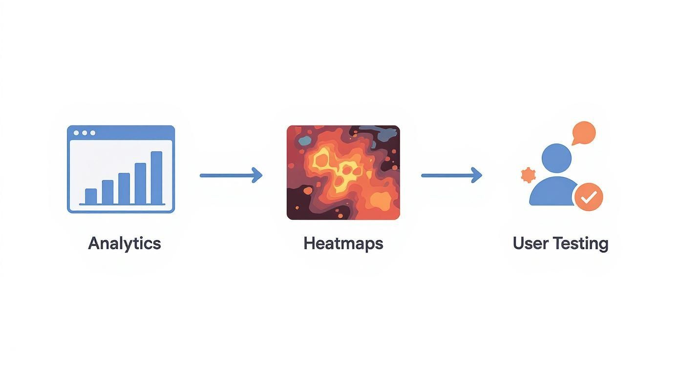
Finding the Friction: A Diagnostic Approach
Effective conversion rate optimisation begins with diagnostics. Before you can fix what's broken, you must systematically hunt for the hidden barriers, frustrations, and moments of confusion that cause users to abandon their journey. Guesswork is expensive; an evidence-based approach is profitable.
This isn't about looking at your overall conversion rate. It's about pinpointing exactly where the commercial leaks are happening and, crucially, understanding why. This means combining quantitative data with qualitative human insights to build a complete picture of user behaviour.
Start with Analytics Data
Your analytics platform, like Google Analytics 4, provides the hard numbers that point to problem areas. Your goal is to answer commercially-focused questions:
Where are we losing people? Identify your high-exit pages. A high exit rate on a blog post is normal. On the final step of your checkout or booking form, it's a red flag signalling a critical conversion blocker.
Which funnel steps are failing? Use funnel exploration reports. If you see a 70% drop-off between a visitor viewing a tour package and adding it to their cart, you've found a high-priority page to investigate.
How does behaviour differ by device? Segment your reports by mobile, desktop, and tablet. If your mobile conversion rate is half your desktop rate, you have significant UX issues on smaller screens that are directly costing you bookings or leads.
Quantitative data tells you what is happening and where. It's the map that shows you the exact locations on your site that need urgent attention.
Watch Real User Behaviour
Once analytics has pointed you to the problem pages, qualitative tools help you understand the 'why'. They turn abstract data points into tangible user frustrations.
Heatmaps provide a visual overlay of where users click, move their mouse, and how far they scroll. On a SaaS pricing page, a heatmap might reveal that users are repeatedly clicking a feature name that isn't a link. This is a clear signal they need more information at that decision point before they will commit.
Session recordings are even more powerful. These anonymised videos of real user sessions let you watch as people navigate your site, hesitate, encounter errors, or 'rage click' in frustration. Watching someone struggle with a clunky date-picker on a hotel booking form provides undeniable proof of a UX flaw that is killing revenue.
Uncover the 'Why' with Direct Feedback
The final diagnostic layer is getting direct feedback from your users. While analytics and recordings show you what users do, only asking them can reveal what they were thinking and feeling.
User Testing: Ask real people from your target audience to complete key tasks on your site while thinking aloud. Hearing a potential client say, "I'm not sure what this service actually includes, I'll look elsewhere," is a powerful insight that data alone could never provide.
UX Audits: A professional UX audit combines a heuristic evaluation (checking your site against established usability principles) with analytics and behavioural data. An experienced eye can quickly spot common conversion killers—a weak value proposition, confusing calls-to-action, or a lack of trust signals—and prioritise them based on their likely commercial impact.
By layering these three approaches, you build a robust, evidence-backed framework. This methodical process ensures you’re not guessing; you're systematically uncovering the real issues. To go deeper, check out our guide on how to find and fix the real conversion killers on your website.
From Diagnosis to Action: Building Your CRO Playbook
Once you’ve found the leaks in your user journey, it's time to move from analysis to action. A scattergun approach of random tweaks is a fast way to waste time and budget. You need a structured, hypothesis-driven playbook to ensure every change is a calculated step towards better commercial outcomes.
This is where you turn your diagnostic findings into an engine for continuous improvement, making educated, evidence-backed changes instead of chasing design trends.
Formulate Testable Hypotheses
A strong hypothesis is the bedrock of any successful CRO test. It’s a clear prediction rooted in the user behaviour you’ve already observed, following a simple structure: If we [implement this change], then [this specific outcome] will happen, because [this is the reason why].
Tourism Example: "If we change the 'Book Now' button colour to a high-contrast orange, then we expect a 10% increase in clicks to the booking page because the button will be far more visually prominent against our blue brand colours."
SaaS Example: "If we add customer logos and testimonials directly below the free trial form, then we predict a 15% lift in sign-ups because it will build trust and social proof right at the point of decision."
Professional Service Example: "If we simplify our enquiry form from seven fields down to four, then we’ll see a 20% increase in qualified leads because it significantly reduces the effort required to get in touch."
Each hypothesis ties a specific action to a measurable commercial outcome, backed by a clear rationale. This gives your tests purpose and makes the results easy to understand.
Prioritise for Maximum Impact
You will generate a long list of ideas. The key is knowing which ones to tackle first to get the biggest commercial return. The PIE framework is a simple and effective method for this.
Score each hypothesis from 1 to 10 across three criteria:
Potential: How much commercial impact could this have? Changing a headline on your main booking page has far more potential than tweaking a link in your footer.
Importance: How valuable is the traffic on the page? A test on your highest-traffic service page is more important than one on an old blog post.
Ease: How simple is this to implement? Changing button text is easy (high score); overhauling your entire checkout flow is complex (low score).
Add up the scores to create a data-informed priority list. This forces you to focus on high-impact, low-effort opportunities first, building momentum and delivering value fast. We've written more about why conversion rate optimisation is broken when treated as just quick fixes.
Run Effective A/B Tests
With a prioritised hypothesis, you're ready to test. A/B testing (or split testing) is the most reliable method. You create a new version of your page (the challenger) and show it to a portion of your audience, while the rest see the original (the control).
Key principles for a successful test:
Use the right tools: Platforms like VWO or Optimizely make it straightforward to set up and run experiments.
Ensure statistical significance: Your test needs a large enough sample size to achieve at least 95% confidence. This proves your results aren't a fluke. Never end a test early just because one version is ahead.
Interpret results holistically: Look beyond the headline conversion rate. Did the change impact average order value or the quality of leads? A true win improves your main goal without harming other key metrics.
This cycle of diagnosing problems, forming hypotheses, prioritising tests, and learning from the results is the core of a successful CRO programme. It transforms your website from a static brochure into a dynamic asset that constantly improves at meeting user needs and driving business growth.
Pinpointing Your Highest-Impact Conversion Opportunities
When it comes to website conversion rate optimisation, not all pages are created equal. The quickest and most significant commercial returns almost always come from just two places: the mobile experience and your primary booking or checkout funnel. For any business that depends on its website for leads or sales, optimising these two areas is non-negotiable.
Your Mobile Site Is Your Main Site
The idea of a "mobile version" of your website is dangerously outdated. For a huge portion of your audience, especially in tourism and local services, mobile is the only channel they will ever use.
Over 65% of service business searches in New Zealand now happen on a mobile device. A clunky, frustrating mobile experience is a direct handbrake on your growth. We've seen websites that fail to design for mobile first lose up to 80% of their potential conversions from that traffic. You can dig into more NZ service business conversion rate benchmarks here.
Optimising for mobile demands a different way of thinking:
Navigation: Can you easily tap menu items with your thumb? Are critical links like "Book Now" instantly visible?
Forms: Keep forms brutally simple. Use single columns, large input fields, and enable auto-fill. A professional services firm asking for ten fields on their mobile enquiry form is actively discouraging leads.
Page Speed: Mobile users are impatient. Every second of delay costs you money.
A slow, clumsy mobile site does more than frustrate people; it signals that you don't value their time. This damages your brand and sends potential customers straight to a competitor with a smoother experience.
Common Mobile UX Mistakes Costing You Conversions
Small frustrations on mobile add up to big revenue losses. These are direct barriers to conversion.
Dissecting Your Booking and Checkout Funnel
Your booking or checkout flow is the final, most critical step where interest should convert into revenue. The smallest friction here can destroy your bottom line, leading directly to abandoned carts and lost bookings. A UX audit of this funnel, backed by heatmaps and session recordings, will almost always uncover a goldmine of opportunities.
Hunt down and eliminate these common conversion killers:
Unclear Pricing & Surprise Fees: A tourism operator who adds a "booking fee" at the final payment screen guarantees a massive drop-off rate. Show all costs upfront.
Confusing Steps: Users need to know where they are. A simple progress bar (e.g., Step 1 of 3) reduces anxiety. Forcing someone to hit the 'back' button to edit details is a classic conversion killer.
Missing Trust Signals: The moment you ask for a credit card, user anxiety skyrockets. Reassure them with security logos, links to your privacy policy, and customer reviews to build the confidence they need to complete the purchase.
Relentlessly simplifying these high-impact areas removes the biggest barriers to conversion. This is the most direct path to increasing bookings, leads, and revenue from your existing traffic.
Measuring What Actually Matters: Tracking Commercial Outcomes
Conversion Rate Optimisation is a commercial discipline, driven by data. The goal is to make calculated changes and rigorously measure their impact on your bottom line. To do this right, you must look beyond the headline conversion rate. Chasing that one number can be misleading.
True CRO success isn't just about bigger numbers; it's about driving valuable outcomes. Your measurement must connect directly to your commercial goals. Are you getting more qualified leads? Are you increasing revenue per visitor? These are the questions your leadership team cares about.
Look Beyond the Headline Conversion Rate
Your main conversion rate is just the starting point. To get a nuanced view of how your CRO efforts are paying off, you need to track a mix of primary and secondary metrics. This balanced scorecard approach ensures you understand the full ripple effect of your changes on user behaviour and revenue.
Essential CRO Metrics to Track
This table breaks down the core KPIs that give you a 360-degree view of your website's commercial performance.
How Do Your Numbers Stack Up? Industry Benchmarks
Knowing your own numbers is step one; putting them in context is step two. Comparing your performance to industry benchmarks can reveal just how much opportunity is on the table.
In New Zealand, the average landing page conversion rate is around 2.35%. The top 25% of sites convert at 5.31% or higher. Yet, a staggering 68% of small businesses in New Zealand lack a structured CRO strategy, and 78% are unhappy with their conversion rates. You can dig into more of these numbers in this report on the state of CRO in New Zealand. These figures show a massive gap between average performance and what is possible with a focused, methodical approach.
Report on Commercial Outcomes, Not Technical Jargon
When sharing CRO results with stakeholders, translate technical jargon into business impact. They need to understand the ROI of your work.
A powerful report answers three questions:
What did we test? (e.g., "We tested a simplified, single-step booking form against our old three-step process.")
What was the result? (e.g., "The new form lifted completed bookings by 18%.")
What does this mean for the business? (e.g., "That translates to an extra £15,000 in projected monthly revenue, without increasing our ad spend.")
By tying every UX improvement directly to a tangible commercial outcome—more revenue, better leads, higher-value customers—you build a powerful case for continued investment in CRO. You shift the conversation from website tweaks to strategic growth.
Your Path to Sustainable Growth
This guide provides a playbook for turning your website into a reliable conversion engine. We've covered how to diagnose hidden UX issues, build a hypothesis-driven testing plan, and focus on fixes that deliver real commercial results.
The key takeaway is this: effective website conversion rate optimisation is never a one-off project. It is a continuous process of understanding your users and methodically removing the barriers they face. This mindset delivers steady, predictable growth in bookings and lead quality, maximising the return on every marketing dollar. Your website becomes a dynamic asset that improves month after month. Learn more about how a consistent approach to user experience optimisation builds long-term value.
The core principle is simple: a better user experience leads directly to better commercial outcomes. Every piece of friction you remove makes it easier for a visitor to become a valuable customer.
Frequently Asked Questions
What’s a realistic website conversion rate to aim for?
It depends on your industry and business model. A tourism operator in New Zealand might see 2-3% for direct bookings as solid, while a SaaS business could aim for 5-7% for free trial sign-ups. Don't get hung up on industry averages. The goal of CRO isn't hitting a magic number; it's about systematically improving your own baseline. Doubling your conversion rate from 1% to 2% is a 100% lift in leads from the same traffic. That’s the win.
How long until we see results from CRO?
You can see the needle move surprisingly fast. Small, focused A/B tests on high-traffic pages can show statistically significant results within weeks. A simple copy or call-to-action change could deliver a measurable lift almost immediately. Larger projects, like a full booking funnel overhaul, naturally take longer to implement and measure. True CRO is a continuous process of testing, learning, and refining.
Can we do this without a huge budget?
Absolutely. While enterprise testing platforms carry a cost, some of the most powerful diagnostic tools are free. You can uncover massive insights by digging into your Google Analytics data, using free-tier session recording tools, and asking a few customers to test your site while you watch. Your biggest investment isn't cash—it's the time dedicated to understanding where your users get stuck. The return from fixing even one of those friction points almost always pays for itself many times over.
Tired of guessing what’s holding your website back? The UX Snapshot is the fastest way to get an expert, data-driven audit. We’ll uncover your biggest conversion gaps and give you an actionable roadmap to higher bookings, better leads, and increased revenue.

Subscribe to our newsletter
Stop losing bookings, get insider tips to turn your website into a conversion machine.
More posts
Insights to help you turn more visitors into bookings, through better SEO, UX, and conversion strategy.
Customer journey mapping for bookings and enquiries (practical guide)

Marketing for B2B: A Modern Playbook for High-Growth

How Strategy and Branding Drives Conversions for NZ Businesses