
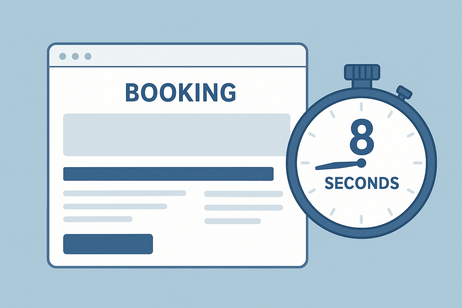
If you run a tourism or service business, you’re not competing with your direct competitors first. You’re competing with confusion, hesitation, and friction. And most websites create all three in the first eight seconds.
Those eight seconds decide whether someone books, enquires, or disappears into the long grass of Google.
This article breaks down the real reasons conversion drops early, how to spot the problems, and the fixes that reliably increase bookings for tourism and service businesses.
1. People don’t instantly understand what you offer
In user testing, we show someone a homepage for ten seconds then close the screen and ask three questions.
What does this business do?
Who is it for?
What should you do next?
If people hesitate or guess, conversions drop.
Not because the site is bad visually, but because the value proposition didn’t land fast enough.
Common symptoms:
- Vague headline such as Welcome or Discover the difference
- Large hero images with no context
- Too many competing messages above the fold
Fix:
A clear, specific headline that spells out the service and the customer outcome. Add a single CTA. Remove distractions.
2. The website doesn’t build trust fast enough
Tourism and service businesses live and die by trust. Yet most homepages push testimonials and social proof too far down the page.
What users actually need quickly:
- Location
- Price expectation or what influences price
- Social proof
- Why you are safe, reliable and worth choosing
Fix:
Bring reviews, experience proof and safety indicators above the fold. Trust first, sales second.
3. The navigation makes people work too hard
Navigation issues were a consistent pattern in your LinkedIn posts with high engagement. It’s because friction hides everywhere: too many menu items, vague labels, inconsistent structure.
When users have to hunt, they bounce.
Fix:
- Cut navigation down to four or five primary items
- Use plain language: Prices, Services, Locations, Book now
- Group related pages under clear categories
- Make mobile navigation even simpler
4. The booking or enquiry path leaks confidence
This is where most revenue disappears quietly.
For tourism sites, the booking calendar or activity selector is often unclear.
For professional services, the enquiry form creates hesitation: too long, unclear purpose, or poor language.
Fix:
- Simplify forms to the minimum
- Write CTAs with intent, not generic Submit
- Avoid multi-step journeys that feel like extra work
- On booking pages, show price, availability and clear next steps early
5. Mobile experience isn’t prioritised
For most tourism and service businesses, over 70 per cent of visitors are on mobile. Yet most sites are designed desktop-first.
The result: scrolling fatigue, hidden calls to action, overlapping elements, slow load times.
Fix:
Design mobile as its own experience rather than a scaled-down version of desktop.
Test your homepage on a real phone, not a design file.
6. The homepage tries to do everything at once
When everything is important, nothing is.
Businesses often add content because internal teams want visibility. Over time the homepage becomes a dumping ground.
Fix:
Refocus the homepage around:
- Who you are
- What you do
- Why choose you
- What to do next
Everything else belongs on subpages.
How to know if your website leaks bookings
Use these three low-effort tests:
1. The ten second test
Show your homepage to someone unfamiliar with your business for ten seconds.
Ask them what you do and why they should care.
If they cannot answer confidently, you have a clarity issue.
2. The scroll test
Open your site on mobile. Scroll for ten seconds.
Count how many times the call to action appears.
If it’s less than three, you’re losing conversions.
3. The task test
Ask someone to book or enquire while you watch.
Every hesitation is a conversion leak.
Why this matters for revenue
Small changes produce outsized gains.
In tourism and service industries, improving conversion by two to five per cent can mean hundreds of thousands of dollars a year in additional bookings without increasing ad spend.
The quickest wins usually come from:
- Clearer value proposition
- Fixing navigation
- Cleaning up forms
- Improving mobile flow
- Stronger CTA language
These improvements create confidence, not pressure, and confidence is the true driver of conversion.
Want a free UX and conversion snapshot for your site?
If you want specific insights for your business, you can request a free UX Snapshot.
You’ll get:
- A quick review of your homepage
- A breakdown of the top three conversion leaks
- Simple fixes with expected impact ranges
- A short video walkthrough
No pressure, no long report, just clear actions to help you capture more bookings.
Request a free UX and Conversion Snapshot for your site

Subscribe to our newsletter
Stop losing bookings, get insider tips to turn your website into a conversion machine.
More posts
Insights to help you turn more visitors into bookings, through better SEO, UX, and conversion strategy.
Customer journey mapping for bookings and enquiries (practical guide)

Marketing for B2B: A Modern Playbook for High-Growth
How Strategy and Branding Drives Conversions for NZ Businesses