
When we talk about “conversion-focused website design,” we’re cutting through the noise. It’s not about winning design awards; it’s about one job: turning your website visitors into customers.
It means moving beyond trendy animations and pretty pictures. Instead, every colour, button, and headline is a deliberate commercial decision, engineered to guide people towards a specific goal, whether that is booking a tour, starting a free trial, or requesting a quote.
From Digital Brochure to Sales Engine

Too many businesses still treat their website like a passive digital brochure. It looks professional, sits quietly online, but does none of the heavy lifting. This is an outdated mindset and a massive commercial blind spot.
Your website should be your most effective salesperson, qualifying leads and generating revenue 24/7.
This leap from a passive information hub to an active sales engine is what conversion-focused design achieves. It’s a strategic blend of User Experience (UX) and Conversion Rate Optimisation (CRO) that puts your user’s needs and your business goals at the centre of every decision.
Why Every UX Flaw Is a Commercial Leak
Here’s the reality: every element on your website either helps or hurts your ability to convert a visitor. There is no neutral ground. Seemingly small UX hiccups have a direct, negative impact on your bottom line.
Consider these real-world scenarios:
For a tourism operator: A clunky, multi-step booking form causes 40% of users to give up. That’s lost revenue, right there.
For a SaaS company: A vague call-to-action on the pricing page leads to fewer trial sign-ups, starving your sales pipeline.
For a professional services firm: A long, intimidating contact form makes high-value clients hesitate and click away, costing you qualified leads.
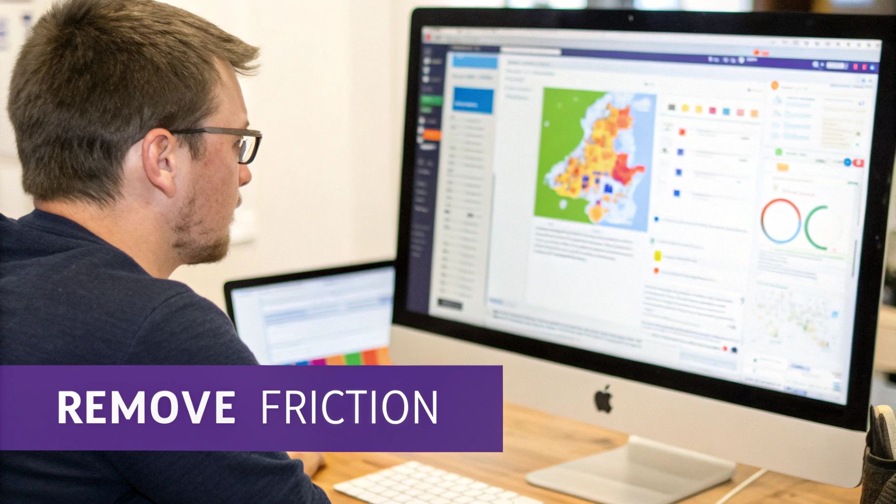
This is where analytics, user testing, and expert UX audits become essential commercial tools. They provide the hard data needed to move from guesswork to evidence-based decisions, pinpointing exactly where friction is costing you money.
A great user experience is not about making things look nice; it is about systematically removing the obstacles that prevent customers from giving you their business. Every fixed usability issue is a direct investment in revenue growth.
Core Principles of Conversion-Focused Design
These simple concepts fundamentally change how you view your website's role. They ensure you're not just decorating a digital space; you're building a machine designed for one thing: commercial results.
A truly conversion-focused website is engineered to deliver specific, measurable business outcomes. The goal isn’t to attract traffic; it’s to guide that traffic towards profitable action.
Identifying and Eliminating Conversion Killers
Friction is the silent assassin of conversions. It’s every confusing instruction, slow-loading page, and hard-to-find button that makes a potential customer give up. These aren't minor annoyances; they are direct leaks in your revenue pipeline. Eliminating these roadblocks is the core purpose of conversion focused website design.
Common Friction Points That Cost You Money
Small UX blunders have an outsized impact on your bottom line. They erode trust and create just enough doubt to make someone abandon their goal, often moments before converting.
SaaS Pricing Pages: A classic mistake is a "Contact Us" button for enterprise plans with no explanation of what happens next. This ambiguity creates hesitation and kills demo requests because busy decision-makers don’t have time for uncertainty.
Tourism Booking Flows: For tour operators, a multi-page checkout that springs unexpected fees at the final step is a notorious conversion killer. It breaks trust instantly and is a leading cause of cart abandonment, directly costing you bookings.
Professional Services Contact Forms: Law firms or consultants often use intimidating forms with too many mandatory fields. Asking for a "budget" or "company size" too early feels intrusive, causing high-quality leads to drop off.
These issues are almost impossible to spot from the inside. That’s why you need an objective, data-driven approach.
Using Data to Pinpoint the Problem
Guesswork has no place in effective website optimisation. You need tools that show you exactly how real users behave and where they get stuck.
Analytics platforms like Google Analytics are your starting point. High exit rates on a specific page in your booking funnel or a sharp drop-off at the payment step are red flags that demand investigation. But analytics only tells you what is happening, not why.
To understand the why, you need qualitative tools.
Heatmaps and session recordings are the closest you can get to looking over your user's shoulder. They reveal where people are clicking in confusion, where they scroll past key information, and the exact moment they give up and leave.
This data is gold. It shows you that users are repeatedly clicking an unclickable element or rage-clicking a button that isn't working on their phone. For a deeper look at this diagnostic process, check out our guide on how to find and fix the real conversion killers on your website.
Technical Performance is a Commercial Issue
Slow page load speeds and a poor mobile experience are massive conversion barriers. A website that takes more than three seconds to load loses almost half its visitors before they even see your offer.
For a traveller trying to book a tour on their phone with a weak signal, a slow, clunky site is a deal-breaker. They won't wait. They'll just find a competitor whose website works. A poor mobile layout with tiny buttons and text that requires pinching and zooming makes any task an exercise in frustration. Since most of your traffic is mobile, ignoring this is commercial negligence.
Mastering The High-Converting User Journey

A successful conversion is never an accident. It’s the final step in a journey you’ve intentionally designed. The best websites guide people from their first click to the final "thank you" page so smoothly that converting feels like the most natural thing to do. This is about building a persuasive path that anticipates user needs, answers their questions, and makes taking action feel easy and obvious.
Establish a Clear Visual Hierarchy
When someone lands on your page, their eyes need a map. A strong visual hierarchy tells them what’s important and where to look next without making them think. It makes your primary goal the most unmissable element. Your headline must grab them first, followed by a benefit-driven subheading, and finally, your call-to-action (CTA). This is achieved through the deliberate use of size, colour, contrast, and white space.
For a tourism operator, the "Book Now" button must be in a bright, contrasting colour that pops. For a SaaS company, the pricing table should use a highlighted box to pull the eye to the most popular plan. If users have to hunt for the next step, you’ve already lost them.
Craft Compelling Calls to Action (CTAs)
Your CTA is the most important instruction on any page. Vague, passive CTAs like "Submit" or "Click Here" are conversion killers because they lack motivation and clarity. A great CTA is specific, valuable, and compelling.
Be Action-Oriented: Start with a strong verb. "Get Your Free Quote" is miles better than "Submit."
Communicate Value: Instead of "Sign Up," try "Start My 30-Day Free Trial." This focuses on what’s in it for them.
Create Urgency (When Authentic): For a travel site, a CTA like "Book Your Spot – Only 3 Left!" can genuinely increase bookings by using scarcity.
Build Trust to Overcome Hesitation
Even with a smooth journey, people won't convert if they don't trust you. Trust signals are the proof that you're credible and reliable, especially when asking for payment details.
Your website can have the perfect layout and copy, but without trust, you're asking users to take a leap of faith. Social proof and security badges act as a safety net, making that leap feel like a small, confident step.
Sprinkle these trust elements near conversion points like checkout forms or contact pages:
Customer Testimonials and Reviews: Showing positive feedback from real clients is powerful social proof.
Case Studies: For B2B or professional services, detailed case studies are proof of your expertise and the results you deliver.
Security Badges: Recognisable logos for payment gateways like Stripe or PayPal and SSL certificates tell users their data is secure.
Industry Accreditations: Logos from well-known industry bodies add professional credibility.
By designing a logical path and backing it up with solid proof, you remove the psychological friction that kills conversions. For tourism businesses, this is critical, as we explore in our guide on how small UX tweaks drive big revenue wins in booking flows.
The Mobile-First Mandate: Your Website's Real Front Door
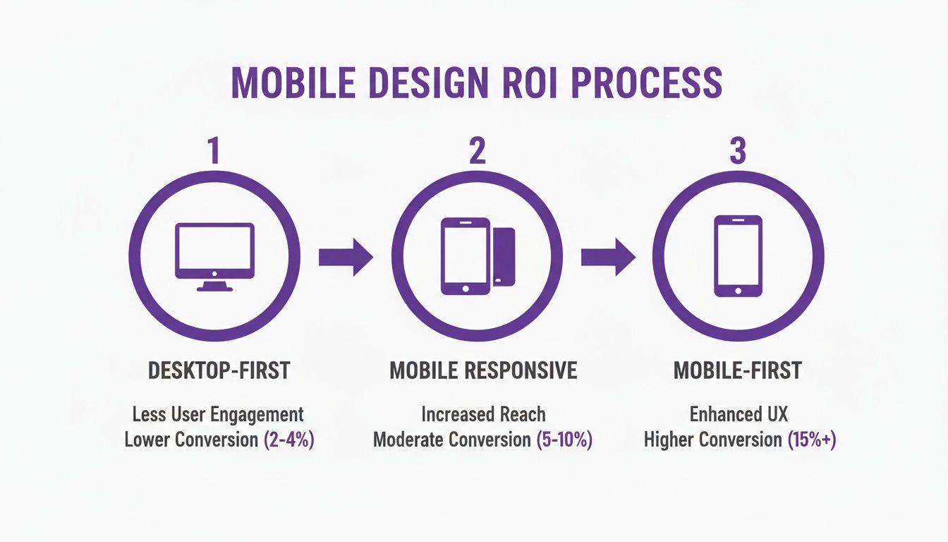
Let's be blunt: your mobile website isn't an add-on. It's the main event. For most of your audience, their first—and often only—interaction with your brand will be on a smartphone. A clunky, slow mobile site is the digital equivalent of a shop with a broken door; it signals you don't value their business.
This is why conversion-focused website design must be mobile-first, not just mobile-responsive. A responsive site simply shrinks your desktop content. A mobile-first site is built from the ground up for someone on a phone.
More Than Just a Smaller Screen
Mobile-first design forces a complete rethink of layout and navigation. It prioritises speed and simplicity for a user who is likely distracted, on the move, and using their thumb.
Key non-negotiables for mobile conversion:
Thumb-Friendly Navigation: Key buttons and links must be large, tappable, and easy to reach, often placed at the bottom or centre of the screen.
Simplified Forms: Mobile forms must be stripped to the essentials, using features like auto-fill and large, clear input fields to minimise typing.
Click-to-Call/Tap-to-Map: A potential client shouldn't have to copy and paste your phone number or address. A single tap should start a call or open their map app. Remove the work.
Blazing-Fast Loading Speeds: Mobile sites must be lightweight, with compressed images and efficient code, so they load in seconds, even on a weak 4G signal.
How a Poor Mobile Experience Silently Kills Revenue
The connection between bad mobile UX and lost money is direct. A tourist trying to make a last-minute booking who encounters a slow checkout will abandon it and book with your competitor whose site actually works. A potential B2B client who gives up on your difficult contact form is a high-value lead you never knew you lost.
A mobile-first approach isn't a technical choice; it's a commercial one. It's acknowledging that the easiest path to revenue is to meet customers where they are and make it incredibly simple for them to act.
Data from over 250 New Zealand service-business websites confirms this. Sites with a true mobile-first design saw 25–35% higher mobile conversion rates, while non-responsive sites watched conversions plummet. You can dig deeper into these NZ service business conversion benchmarks to see the numbers yourself.
Your Practical Website Conversion Audit Checklist
Theory is great, but action drives results. This checklist is a hands-on diagnostic tool to run a high-level conversion audit on your own site. Use it to spot the most obvious issues and build a simple roadmap for what to fix first to improve bookings, leads, and sales.
Clarity and Value Proposition (The 5-Second Test)
If a visitor can’t instantly figure out what you do and why it matters, they’re gone. Clarity is the bedrock of conversion focused website design.
Does your headline state what you offer in simple terms? A tourism operator should use "Private Guided Tours of Queenstown," not "Experience Transcendent Journeys." Clarity beats creativity every time.
Is your main call-to-action (CTA) immediately visible without scrolling? Your "Book a Demo" or "Check Availability" button must be prominent and high-contrast.
Can a new visitor understand your unique value in under five seconds? If they have to read three paragraphs to understand why they should choose you, your value proposition is buried.
Friction and Usability
Friction is anything that makes using your site difficult, confusing, or slow. Every piece you remove makes it easier for a customer to give you their business.
How many clicks does it take to complete your main goal? For a SaaS company, that's a trial sign-up. For a tour operator, it’s a booking confirmation. Every unnecessary step causes drop-off.
Are your forms as short as they can possibly be? A law firm asking for a budget and company size on an initial contact form creates massive friction. Ask only for what you need to start the conversation.
Is your navigation logical? Don’t make users hunt for essentials like "Pricing" or "Contact." Stick to predictable conventions.
Trust and Credibility
People buy from businesses they trust. Your website must actively build that confidence, especially around conversion points.
Trust signals like customer reviews aren't just decorative; they are essential for overcoming the natural hesitation a user feels before committing to a purchase or enquiry.
Are customer testimonials visible near your main CTAs? Placing social proof right next to a "Book Now" or "Get a Quote" button reassures users at the critical moment of decision.
Do you show security badges or payment logos in your checkout? Simple visual cues that tell visitors their data is safe can measurably reduce cart abandonment.
Using Data to Guide Your Design Decisions
A conversion-focused website is never "set and forget." The best ones evolve, guided by real user behaviour. This is where you shift from educated guesses to evidence-based decisions that build on each other over time, turning a good website into a powerful, ever-improving conversion engine.
From Analytics to Actionable Insights
Stop treating analytics as a passive reporting tool. Tools like Google Analytics are goldmines for spotting where your user journey is breaking. Setting up conversion goals is non-negotiable; you must track how many people complete key actions like submitting a form or finalising a booking. A high exit rate on a specific page in your checkout funnel is a massive red flag. It screams "friction!"
But analytics only tells you what is happening, not why. To get to the why, you have to watch what people do.
Heatmaps and session recordings from tools like Microsoft Clarity or Hotjar are the closest you can get to looking over your user’s shoulder. They show you where people click, how far they scroll, and where they get stuck, turning abstract numbers into clear directives for what to fix.
A heatmap might show that dozens of people are clicking on a heading they think is a button. That’s a clear, data-backed design flaw you can fix immediately.
A Practical Approach to A/B Testing
Once data gives you a solid hypothesis—for example, "Our vague 'Submit' button is putting people off"—you need to test it. A/B testing shows two different versions of a page to different users to see which one performs better. The golden rule is to test one significant change at a time.
SaaS Example: Test your homepage headline. Does "AI-Powered Project Management" get more demo requests than "Finish Projects Faster"? You won't know until you test.
Tourism Example: Test the colour and text of your "Book Now" button. Does a bright orange button with "Check Availability & Book" outperform a subtle blue one that just says "Book"?
By isolating one change, you can be confident that any uplift in conversions is because of that specific decision. This is also a great time to do a UX competitor analysis to see how others are tackling similar challenges. This cycle—analyse, hypothesise, test, measure—is the engine of continuous improvement.
Your Top Questions Answered
We get these questions a lot from marketing leaders, tourism operators, and professional services businesses ready to turn their website into a proper sales engine. Here are straight-up answers.
How Long Does It Take to See Results?
It depends on the change. Small, high-impact fixes—like rewriting a confusing call-to-action or making a mobile button easier to tap—can produce a measurable lift in days. These are the quick wins a good UX audit uncovers. Bigger changes like a checkout redesign take longer to validate, typically requiring a few weeks of data. The key is to base every change on user data and track the results in your analytics.
What's the Difference Between UX Design and CRO?
They are two sides of the same coin; you can't have one without the other.
User Experience (UX) Design is about making your website easy and intuitive to use. Its main job is to remove friction.
Conversion Rate Optimisation (CRO) is the process of testing and refining that experience with one specific goal: getting more people to take the action you want.
You can't do effective CRO on a website with a broken UX. Great user experience is the foundation.
Do I Need Expensive Tools to Get Started?
Absolutely not. You can get a huge amount of insight from free tools. Google Analytics is non-negotiable for tracking goals. Free versions of heatmap tools like Microsoft Clarity or Hotjar show you exactly where users get stuck. The most important ‘tool’ is a change in mindset: start looking at your website through your customers' eyes, find their biggest frustrations using the data you have, and start fixing them.
How Often Should I Be Auditing My Website?
We recommend a deep-dive conversion audit at least once a year or before any major redesign. But optimisation is a continuous process. A good rhythm is a quarterly 'health check' of your key landing pages, funnels, and mobile performance in analytics. This helps you spot emerging problems and keep nudging your site towards better commercial results.
Uncover the hidden conversion gaps costing you money. Our UX Snapshot service is the fastest way to get an expert diagnosis of your website’s biggest conversion opportunities.

Subscribe to our newsletter
Stop losing bookings, get insider tips to turn your website into a conversion machine.
More posts
Insights to help you turn more visitors into bookings, through better SEO, UX, and conversion strategy.
Customer journey mapping for bookings and enquiries (practical guide)
Marketing for B2B: A Modern Playbook for High-Growth
How Strategy and Branding Drives Conversions for NZ Businesses