
Your landing page isn’t just a digital brochure; it's a high-stakes commercial tool. For a SaaS business, it's the gateway to a free trial. For a tourism operator, it's a direct booking engine. For a professional services firm, it's the primary source of qualified leads. Yet, countless businesses hemorrhage conversions due to easily fixable user experience (UX) flaws—confusing layouts, slow load times, and vague messaging that fails to connect.
A poorly optimised landing page directly wastes ad spend and undermines your growth. The difference between a page that converts at 2% and one that converts at 10% isn't just an incremental gain; it's a fundamental shift in your customer acquisition economics. This guide cuts through the noise. It delivers 10 practical landing page optimization best practices, grounded in conversion rate optimisation (CRO) and UX principles. We’ll provide actionable steps with specific examples from SaaS, tourism, and professional services, showing how user-centric design directly translates into more bookings, higher-quality leads, and a stronger return on investment.
1. Nail Your Value Proposition: Clarity Converts, Confusion Kills
Your value proposition must instantly answer a visitor's core question: "What's in it for me, and why should I choose you?" If a user can’t grasp the specific outcome you deliver within five seconds, they will leave. This isn't just a headline; it's a strategic promise that reassures visitors they've found the right solution to their problem.
A vague or generic value proposition is a primary cause of high bounce rates, a common finding in UX audits. For a tourism operator in Queenstown, 'Book a Trip' is a weak command. 'Unforgettable Private NZ Wine Tours, Expertly Guided' is a compelling promise that matches specific user intent. A SaaS company should move beyond 'Powerful Project Software' to 'The All-in-One Platform That Replaces Five of Your Tools', immediately highlighting a tangible, cost-saving benefit that drives trial sign-ups.

How to Craft a High-Converting Value Proposition
Getting this right is the cornerstone of landing page optimisation. It attracts qualified leads and filters out those who aren't a good fit, improving lead quality from the very first click.
Actionable Steps:
Focus on Outcomes, Not Features: A professional services firm shouldn't say 'We offer strategic consulting'; they should say 'We Help Tech Firms Achieve 20% Year-on-Year Growth'. The benefit is the measurable outcome, not the process.
Be Specific and Clear: Avoid marketing jargon. Instead of 'synergistic business solutions', try 'One Simple Dashboard for Your Entire Team's Workflow'. Clarity builds trust and reduces the cognitive load on your visitors.
Make it Visually Prominent: Use a large, bold H1 tag for your main headline and a supporting sub-headline to add context. Place it high on the page, surrounded by whitespace, so it's the first thing a visitor reads.
Validate Your Message with User Testing: Don't guess. Run simple five-second tests to see if users can accurately describe what your business does. Use A/B testing tools to compare different headlines and measure their direct impact on conversions.
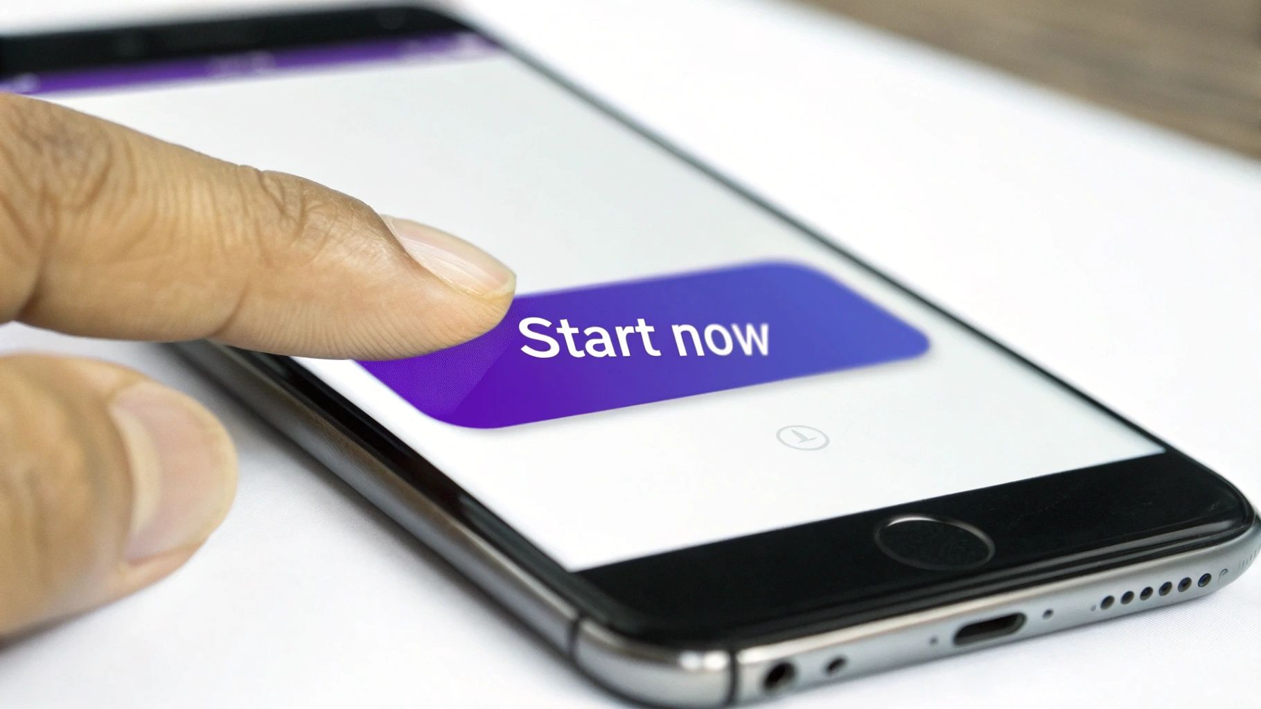
2. Single, Clear Call-to-Action (CTA)
Once your value proposition captures interest, you must guide visitors to the next logical step with an unmissable call-to-action. The goal of a landing page is to drive a single, specific action—booking a demo, starting a trial, or requesting a quote. Offering multiple competing CTAs, like ‘Book Now’ next to ‘Learn More’ and ‘Contact Us’, creates decision paralysis and kills conversion momentum. A visitor confused about what to do next will almost always choose to do nothing.
This singular focus is a core tenet of landing page optimization best practices. During UX audits, we frequently find pages with multiple, equally-weighted CTAs that directly correlate with low conversion rates. A SaaS company must prioritise ‘Start Free Trial’ over secondary links like ‘Explore Features’. A professional services firm will generate more qualified leads by focusing on a single ‘Get My Free Proposal’ button rather than distracting visitors with ‘Read Our Blog’ or ‘Meet the Team’ in the same prominent space.
How to Design a High-Impact CTA
A well-designed CTA acts as a clear signpost, eliminating friction and making the conversion path feel effortless. It must be the most visually dominant, clickable element on the page.
Actionable Steps:
Use Action-Oriented, Value-Driven Copy: Replace passive words like ‘Submit’ with compelling language that implies a benefit. Try ‘Get Your Free Quote’, ‘Book Your Tour Now’, or ‘Start My 30-Day Trial’. These phrases create a sense of ownership and immediate value.
Make it Visually Striking: Your CTA button must stand out. Use a high-contrast colour that pops against the background but aligns with your brand. Heatmaps consistently show that brightly coloured, well-placed buttons receive the most clicks.
Optimise Size and Placement: The button should be large enough to be easily tapped on mobile (a minimum of 44x44 pixels is a good starting point). Place it above the fold and repeat it further down the page for longer landing pages.
A/B Test Everything: Don't assume what works best. Systematically test button copy (‘Get Started’ vs. ‘Start Free Trial’), colour (blue vs. orange), and placement to find what drives the highest conversions for your specific audience.
3. Strategic Use of White Space and Clean Design
In landing page design, what you don't include is often as powerful as what you do. White space (or negative space) is the unmarked area around your text, images, and buttons. It’s an active design tool that reduces cognitive load, improves readability, and guides the user's eye towards the most important action. A cluttered page overwhelms visitors and signals a lack of professionalism; a clean design builds trust and makes your core message impossible to miss.
Poor use of space is a common UX issue that directly harms conversions. A professional services firm might cram testimonials, service lists, and contact forms together, creating a wall of text that repels high-value leads. The solution isn't more information; it's better organisation. Apple’s product pages are a masterclass in this: their generous use of white space makes the product the hero and the "Buy Now" button a clear destination. This minimalist approach feels premium and makes the user journey effortless.
How to Implement a Clean, High-Converting Design
A clean layout isn’t an aesthetic choice; it’s a conversion strategy. It creates a visual hierarchy that tells visitors exactly where to look and what to do next, directly impacting lead generation and sales.
Actionable Steps:
Embrace Generous Spacing: Increase the space between paragraphs, headlines, and images. For body text, set your line height to at least 1.5 to improve scannability and comprehension.
Limit Your Visual Language: Stick to a maximum of two font families and a disciplined colour palette. Consistency reduces visual noise and reinforces brand identity.
Ruthlessly Remove Non-Essential Elements: Does that social media feed widget really help someone book a demo? Scrutinise every element. If it doesn't directly support the primary conversion goal, remove it.
Use a Grid System: A consistent grid provides an underlying structure, ensuring elements are aligned and spaced logically. This creates a sense of order and professionalism that builds trust.
Analyse Heatmaps to Identify Distractions: Use tools like Hotjar to see if users are getting distracted by clutter. Heatmaps can reveal if key elements, like your CTA, are being overlooked because of poor spacing.
4. Mobile-First Responsive Design
Over 60% of web traffic now comes from mobile devices, making a mobile-first approach non-negotiable. This means designing your landing page for the smallest screen first, then progressively enhancing it for larger screens. It ensures the core experience is optimised for the majority of users, delivering a fast, accessible, and user-friendly interface on any device.
A poor mobile experience is a guaranteed way to lose conversions. If users have to pinch, zoom, or struggle with tiny form fields, they will abandon your page and go to a competitor. A common mistake we uncover in UX audits is when a desktop design is simply shrunk down, resulting in unreadable text and impossible-to-tap buttons. For a tourism operator, a seamless mobile booking process is critical, as travellers often book on the go. For a SaaS business, the ability to sign up for a trial easily on a phone is paramount.
How to Implement a Mobile-First Design
A responsive design directly impacts user experience, search engine rankings, and your conversion rate. It's a foundational element of modern landing page optimisation.
Actionable Steps:
Prioritise Touch Targets: Ensure all buttons, links, and form elements are large enough to be easily tapped. Aim for a minimum size of 44x44 pixels to avoid user frustration.
Optimise for Performance: Mobile users expect speed. Compress images using modern formats like WebP, minimise JavaScript, and leverage browser caching to ensure your page loads in under three seconds.
Use Mobile-Friendly Forms: Utilise native HTML input types (e.g.,
type="email",type="tel") to trigger the correct mobile keyboard. This simple change significantly reduces the effort required to complete a form.Test on Real Devices: Browser emulators are useful, but they don't replicate the real-world experience of a slow network or different screen sizes. Always test your landing page on a range of actual iOS and Android devices to catch layout issues and performance bottlenecks.
5. Prioritise Fast Page Load Speed and Performance
In landing page optimisation, speed is a foundational requirement. Your page's load time is one of the first interactions a visitor has with your brand, and every millisecond counts. If your page for a SaaS trial or professional service quote takes too long to load, potential leads will abandon it before they even see your value proposition. Google's research shows that the probability of a bounce increases by over 32% as page load time goes from 1 to 3 seconds.
Slow performance directly undermines all other optimisation efforts. A beautifully designed page with a compelling CTA is useless if it fails to load. For a tourism operator in New Zealand, a visitor trying to book an activity on a patchy mobile network will simply give up and book with a faster competitor. This is a critical aspect of landing page optimization best practices because it respects the user's time and sets a positive, professional first impression.
How to Boost Your Landing Page Performance
Treating page speed as a core conversion metric is essential for success. Faster pages lead to better user engagement, higher search rankings, and ultimately, more bookings and leads.
Actionable Steps:
Compress and Optimise Images: Large, uncompressed images are the most common cause of slow pages. Use tools like TinyPNG to reduce file sizes without losing visual quality, and serve images in modern formats like WebP.
Minify Code and Defer Scripts: Reduce the size of your CSS, JavaScript, and HTML files by removing unnecessary characters (minification). Defer the loading of non-critical JavaScript so the essential content renders first.
Leverage a Content Delivery Network (CDN): A CDN stores copies of your landing page on servers worldwide. This ensures visitors, including international tourists looking at NZ travel options, load your content from a server geographically close to them, dramatically reducing latency.
Benchmark with Core Web Vitals: Use Google's Core Web Vitals (LCP, INP, CLS) as your key performance indicators. Tools like Google PageSpeed Insights and GTmetrix provide detailed reports and actionable recommendations to improve these scores, which directly impact user experience and SEO.
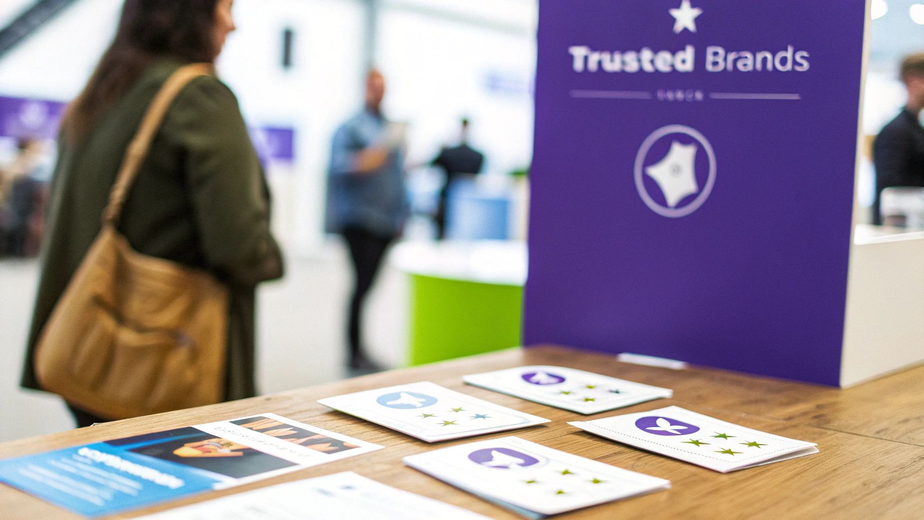
6. Build Credibility with Trust Signals and Social Proof
Visitors arrive on your landing page inherently sceptical, asking, "Can I trust this company?" Trust signals and social proof are the evidence you provide to answer that question with a resounding "yes." These elements reduce perceived risk and build credibility by showing that other people and respected organisations have had positive experiences with you.
Social proof is a powerful psychological trigger. When people are uncertain, they look to the actions of others to determine their own. For a SaaS platform, this means showing logos of well-known clients. For a professional services firm, it's a detailed case study with measurable results like "Increased leads by 45%." For a tourism business, it’s recent, glowing reviews on TripAdvisor. Failing to leverage this is a common conversion killer we identify in UX audits, leaving potential customers feeling hesitant and unsure.
How to Implement High-Impact Social Proof
Integrating authentic social proof validates your value proposition and reassures visitors that choosing you is a safe, intelligent decision.
Actionable Steps:
Use Specific and Relatable Testimonials: Vague praise like "Great service!" is weak. A quote like "We increased qualified leads by 40% in the first quarter" from a specific client (e.g., Jane Smith, Marketing Manager at Company X) is far more persuasive.
Display Recognisable Client Logos: If you serve well-known brands, showcase their logos prominently. This borrows their credibility and instantly elevates your status. For example, a SaaS company might feature logos from major enterprise clients near its primary CTA.
Leverage Third-Party Validation: Integrate reviews from trusted platforms like Trustpilot, G2 (for SaaS), or TripAdvisor (for tourism). These are seen as more objective and unbiased. Security badges (e.g., Norton, McAfee) and industry certifications also build immense trust.
Place Proof Near Conversion Points: Don't hide your best testimonials. Place a powerful quote or a key client logo directly beside your sign-up form or "Book Now" button to overcome last-minute hesitation.
7. Strong Visual Hierarchy and Scannable Content
Visitors don’t read web pages; they scan them. Acknowledging this is fundamental to effective landing page design. A strong visual hierarchy guides the user's eye through the most critical information in a logical order, using elements like size, colour, and spacing. This ensures your value proposition, call-to-action, and key benefits are absorbed in seconds, not lost in a wall of text.
A page without a clear hierarchy forces users to work too hard, leading to frustration and high bounce rates. We frequently see this in UX audits where critical information is buried or given the same visual weight as minor details. For a SaaS company, the 'Start Free Trial' button should be the most visually dominant element, not competing with a 'Learn More' link. Similarly, a professional services firm should use larger headings for client outcomes ('Double Your Qualified Leads in 90 Days') and smaller text for process details.
How to Create a Scannable, High-Impact Layout
Implementing a logical flow is a core part of landing page optimization best practices. It reduces cognitive load so visitors can make a quick, confident decision. Find out more about how structured design impacts conversions in our guide to user experience optimisation.
Actionable Steps:
Use Proper Heading Structure: Start with a single, compelling H1 for your value proposition, followed by H2s for major sections. This improves scannability for users and provides context for search engines.
Keep Paragraphs and Lines Short: Aim for paragraphs of no more than 3-4 lines and a line length of 60-70 characters to improve readability and prevent visual fatigue.
Leverage Bullet Points and Bolding: When listing features, benefits, or steps, use a bulleted list. Use bold text strategically to draw attention to the most persuasive words or data points within a sentence.
Create Visual Separation: Use ample whitespace around key elements like your CTA button, forms, and value proposition. This makes them stand out and tells the user, "This is important."
8. A/B Testing and Data-Driven Optimisation
Assumptions are the enemy of high-performing landing pages. A/B testing is the systematic process of comparing two versions of a page (a control and a variation) to see which one performs better. By changing a single element—a headline, CTA button colour, or form length—you can gather empirical data on what truly resonates with your audience. This data-driven approach removes guesswork and ensures your efforts lead to measurable improvements in bookings, leads, or sales.
This is a core tenet of landing page optimization best practices. Instead of debating whether a green or orange button converts better, you test it and let user behaviour provide the answer. For a SaaS business, testing a "Start Free Trial" CTA against "Request a Demo" can reveal critical insights about user intent and lead quality. For a tourism operator, testing a hero image of a landscape versus one with happy customers can significantly impact booking rates.
How to Implement Data-Driven A/B Testing
Continuous testing creates a powerful feedback loop, turning your landing page into an evolving asset that adapts to user preferences and maximises commercial outcomes.
Actionable Steps:
Prioritise High-Impact Tests: Start by testing elements with the biggest potential impact on conversion: your main headline, primary CTA, hero image, or the number of form fields.
Test One Variable at a Time: To get clean data, only change one element between your control and variation. If you change the headline and the button colour, you won’t know which change caused the performance shift.
Ensure Statistical Significance: Don’t end a test prematurely. Use a calculator to ensure your results are statistically significant, meaning the outcome is unlikely due to random chance. Aim for a confidence level of 95% or higher.
Document Everything: Keep a detailed log of every test: your hypothesis, the variants, the results, and what you learned. This builds a valuable knowledge base for future optimisation.
9. Optimised Form Design and Minimal Form Fields
Your form is the final gateway to conversion, but it's also where the most friction occurs. Every unnecessary field, confusing label, or moment of hesitation increases the likelihood of abandonment. Optimised form design focuses on removing barriers to create a seamless, intuitive path for the user to submit their information.
The impact of poor form design is immediately visible in analytics. A SaaS company asking for a credit card upfront for a free trial introduces massive friction. A professional services firm asking for 'Annual Revenue' on a first-contact form can feel intrusive and premature, killing lead generation. The goal is to ask for the absolute minimum information required to qualify the lead or complete the transaction. Each field you remove is one less reason for a visitor to give up.
How to Reduce Form Friction and Boost Submissions
Reducing form friction is a direct and powerful lever for improving conversion rates and lead quality.
Actionable Steps:
Limit Fields to the Essentials: Challenge every field. Do you truly need their phone number right now? For an initial lead, a name and business email are often sufficient. You can gather more data later in the sales process.
Use a Single-Column Layout: Studies consistently show that single-column forms are easier and faster for users to parse, reducing cognitive load and improving completion rates, especially on mobile.
Place Labels Above Input Fields: This is the most user-friendly approach. It keeps the label visible as the user types and creates a clear, logical flow.
Implement Inline Validation: Provide real-time feedback. A green tick for a valid email or a red message for an error prevents frustration when they hit 'Submit'.
Use Clear Error Messages: Instead of a generic "Error", be specific: "Please enter a valid email address". This guides the user to a quick fix.
10. Targeted Copy and Audience Segmentation
Generic copy speaks to everyone and therefore connects with no one. Effective landing page copy must address a specific audience's unique needs, pain points, and language. Audience segmentation is the practice of creating different landing page variations for distinct visitor groups, ensuring the message they see is hyper-relevant to their context.
This doesn't mean creating dozens of websites; it's about strategic adjustments. A SaaS company might show a different headline to visitors arriving from a "small business" Google ad versus an "enterprise solutions" campaign. A tourism operator could create a page for "family holidays" and another for "adventure travel," each highlighting different activities and benefits. This level of personalisation makes visitors feel understood and dramatically increases the likelihood of conversion by directly addressing their specific problems.
How to Implement Targeted Copy and Segmentation
Personalised copy builds immediate rapport. By tailoring your message, you demonstrate a deep understanding of the visitor's world, a powerful way to stand out. To find your unique angle, you should first understand your competitors' messaging. Learn more about conducting a competitor analysis for UX.
Actionable Steps:
Segment by Traffic Source: Customise your headline and hero copy for visitors from Google Ads, LinkedIn, or email campaigns. The messaging must match the promise made in the ad they clicked.
Speak the Customer's Language: Use insights from customer interviews and surveys. Ditch corporate jargon and adopt the exact phrasing your customers use to describe their challenges and desired outcomes.
Address Objections Head-On: Does your audience worry about price or implementation time? Use your copy to proactively address these concerns. For a professional service, this could be, "Get Started in 48 Hours with Our Streamlined Onboarding".
Lead with Specific, Quantifiable Benefits: Instead of saying 'Improve your marketing', say 'Generate 30% More Qualified Leads in 90 Days'. Concrete numbers are more persuasive than vague promises.
Uncover Your Biggest Conversion Gaps in Just 10 Days
Applying these best practices is a powerful start, but the fastest path to increased revenue is identifying the specific friction points hurting your unique website. Generic checklists can't reveal why your visitors are abandoning their bookings or failing to request a demo. You need an expert diagnosis.
Our UX Snapshot service is designed for busy marketing leaders, product teams, and business owners who need actionable insights, fast. We combine heuristic analysis, user behaviour data, and CRO expertise to pinpoint the most critical conversion gaps on your key landing pages. We deliver a prioritised action plan in just 10 days, showing you exactly what to fix to increase bookings, generate higher-quality leads, and improve your trial-to-paid conversion rate.
Stop guessing and start converting. Let us find the hidden revenue opportunities you're currently missing.

Subscribe to our newsletter
Stop losing bookings, get insider tips to turn your website into a conversion machine.
More posts
Insights to help you turn more visitors into bookings, through better SEO, UX, and conversion strategy.
Customer journey mapping for bookings and enquiries (practical guide)
Marketing for B2B: A Modern Playbook for High-Growth
How Strategy and Branding Drives Conversions for NZ Businesses