

Let's be clear: your value proposition isn't a fluffy marketing slogan. It's a direct, measurable promise of the results a customer gets from you. It's the reason someone should book your tour, sign up for your SaaS trial, or hire your firm instead of a competitor. Get it wrong, and you're leaking revenue before a visitor even scrolls.
A weak proposition means wasted ad spend, low-quality leads, and missed bookings. We see this constantly in UX audits and user behaviour analytics. Heatmaps show visitors' cursors wandering aimlessly on homepages with confusing messaging before they abandon the site completely.
What Value Positioning Really Means on a Homepage
The top of your homepage—the 'above-the-fold' section—is a high-stakes interview. You have less than five seconds to convince a visitor you solve their specific problem. Your value proposition is the immediate answer to their silent, urgent questions. This is where user experience (UX) and conversion rate optimisation (CRO) begin.
The Three Questions Every Visitor Asks
A high-converting homepage for any service business, from tourism to tech, must instantly answer three questions:
What is this? Can the visitor understand what you do in a heartbeat? Clarity beats cleverness.
Is this for me? Does your message resonate with your target audience, making them feel you understand their world?
Why should I choose this? This is your differentiator. What unique outcome do you deliver that others don't?
Before/After Logic: The Impact of Clear Messaging for Service Businesses
Let's examine a typical professional services firm. A weak, generic proposition might state: "Innovative Strategic Solutions for Business Growth." This tells a visitor nothing useful and forces them to work to understand your offer—a classic UX mistake that kills conversions.
Now, a sharp, outcome-focused version: "We Help Trades Businesses Win 50% More Tenders with Expertly Written Proposals in Under 48 Hours."
The 'after' example works because it's specific, outcome-driven, and speaks directly to the audience's pain points. It transforms a vague promise into a tangible business result, turning your website from a digital brochure into a reliable lead generation machine.
The Anatomy of a High-Converting Value Proposition
A great value proposition isn’t a single tagline. It's a strategic block of messaging—a combination of copy and visuals working together to make a powerful first impression. This isn't about creative wordplay; it's about structuring your message so a potential customer instantly understands your value and feels they are in the right place.
Your homepage hero section must be ruthlessly efficient. In our UX audits, we consistently find that when these core components are unclear, bounce rates skyrocket and potential customers are lost before they even scroll.
Above-the-Fold Heuristics: The Core Components
To build immediate trust and clarity, your above-the-fold content must follow a proven framework. These elements work together to answer a visitor's key questions subconsciously.
Headline: Your knockout punch. It must communicate the #1 end benefit your customer gets. Focus on the outcome, not your company name.
Sub-headline: A one- or two-sentence explanation that clarifies what you offer, who it's for, and your key differentiator.
Bullet Points (2-3): List key benefits or features that back up your headline's promise, giving tangible reasons to believe.
Hero Visual: A high-quality image or short video that reinforces your message. For a tourism operator, it’s a stunning view; for a SaaS product, it’s a clean screenshot of the software in action.
Value Proposition Component Checklist
This table shows the shift from company-centric jargon to customer-centric outcomes that drive action.
Why Clarity Beats Cleverness Every Time
The biggest mistake we see in UX audits is businesses using vague, meaningless jargon. Statements like “Innovative Synergies” or “Future-Forward Solutions” mean nothing to a user. They create cognitive friction, forcing people to work just to figure out what you do. This confusion directly tanks lead quality and booking rates.
Your value proposition must be instantly understandable. If a new visitor has to re-read it to understand what you do, you've already lost their attention and their business.
The specific words you choose are critical. Learning the art of crafting compelling website copy that sells is non-negotiable. Every element must work together to build immediate confidence and guide the user to the next step.
Making an Instant Impact Above the Fold
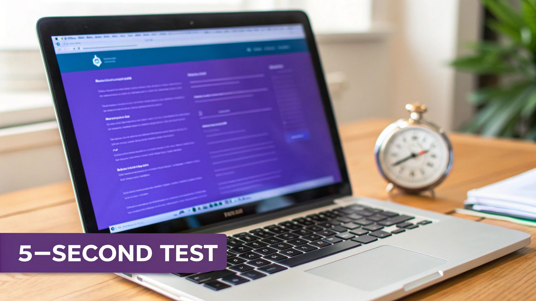
The patch of screen a visitor sees without scrolling is your most valuable digital real estate. It's called 'above the fold', and it's where your value proposition does all the heavy lifting. You have mere seconds to prove you’re the right choice. Good UX here isn’t a nice-to-have; it’s the gatekeeper to every booking, enquiry, or sale.
The acid test is the ‘5-second test’. Can a first-time visitor figure out what you do, who you do it for, and why they should choose you in five seconds? If not, you have a conversion problem, usually stemming from a messy visual hierarchy or a weak call-to-action (CTA).
Finding and Fixing Common UX Sticking Points
Heatmaps are invaluable for diagnosing these issues. They show you exactly where people are looking and clicking—or, more importantly, what they’re ignoring. Often, you'll see cursors jump right over the main headline or fail to find the primary CTA button. That’s a massive red flag that your layout is failing to guide users.
A classic mistake, especially for service businesses, is cluttering this prime space with secondary links or contact details. This dilutes the power of your core message. Your main headline and "Book a Demo" or "Get a Quote" button must be the most unmissable elements on screen.
For New Zealand's fierce tourism sector, the stakes are high. While average e-commerce conversion rates sit around 2.5% to 3%, many Kiwi operators see far lower numbers. In our analysis, we often find 70-80% of bounces on booking pages come from confusing CTAs—a direct failure of above-the-fold design. You can find more on NZ conversion rate benchmarks on Shopify.com.
A powerful above-the-fold experience isn’t about aesthetics. It’s about strategically channelling a user's focus towards your core message, eliminating confusion, and creating a frictionless path to conversion.
Actionable Steps for a Quick Lift
To sharpen your above-the-fold experience, start by seeing how your competitors frame their propositions. We break this down in our guide on performing a competitor analysis with a UX focus. Then, apply these simple heuristics:
Make Your Headline King: It should be the biggest, boldest text on the page and shout a clear benefit.
Give Your CTA the Spotlight: Use a contrasting colour to make your main button pop. The text must be action-focused, like "Get Your Free Quote," not a passive "Submit."
Declutter the View: Remove anything that competes for attention, like excessive navigation links or social media icons that pull people away from the main goal.
Real-World Examples of High-Converting Value Propositions
Theory is one thing, but seeing a homepage transform from a vague brochure into a lead generation tool is where the real learning happens. We'll break down 'before' and 'after' examples from SaaS, tourism, and professional services. The 'after' versions aren't flashier; they're just clearer and focused on the value a customer gets.
SaaS Business: From Vague Features to Clear ROI
For any Software-as-a-Service (SaaS) business, the goal is trial sign-ups or demo bookings. Your value proposition must quickly show how your tool saves time, makes money, or reduces effort.
Before (Weak): "The Future of Team Collaboration is Here."
- This is marketing fluff. It tells the user nothing about what the product does, forcing them to work to figure it out. Most won't bother.
After (Strong): "Cut Your Project Admin Time in Half. Manage client projects, track budgets, and automate reports—all in one place. Start your free 14-day trial."
- This is effective. It leads with a tangible benefit ("cut time in half"), lists core functions, and ends with a low-risk call-to-action.
Tourism Operator: From Generic Promises to a Must-Do Experience
If you're selling an experience, you're selling a feeling. Your value proposition must create excitement and build trust simultaneously, promising a unique memory while making booking simple and safe.
Before (Weak): "Discover the Beauty of Queenstown."
- This is generic and blends in with dozens of competitors. It gives a user no reason to choose this company.
After (Strong): "Your Private Helicopter Tour of Fiordland’s Glaciers. Skip the crowds and experience untouched landscapes with our expert local pilots. See packages and availability."
- This works because it's specific. It sells the unique hook ("private helicopter tour"), tackles a pain point ("skip the crowds"), builds authority ("expert local pilots"), and directs users to the next step.
Professional Services Firm: From Corporate Jargon to Real Authority
For consultants, agencies, or any professional service, the goal is high-quality leads. Your value proposition must build trust instantly by showing you understand a specific client's problems.
New Zealand SaaS companies face tough trial-to-paid conversion rates of just 1.4%, which drop even lower without a clear ROI statement. Similarly, 54% of e-commerce checkouts are abandoned due to trust gaps. Value propositions that build instant trust, like "Trusted by 500+ NZ Businesses," are crucial for boosting conversions. Discover more about optimising B2B conversion rates on Shopify.com.
Before (Weak): "Strategic Business Optimisation Services."
- This is corporate jargon. It feels impersonal and fails to connect with a potential client's real-world challenges.
After (Strong): "We Help Construction Firms Win More Tenders. Our expert proposal writers deliver bid-winning documents in 48 hours, so you can focus on running your business. Book a free consultation."
- This is a lead-generation machine. It calls out the exact audience ("Construction Firms"), states a precise outcome ("Win More Tenders"), and uses speed as a key selling point ("48 hours").
Common Mistakes That Weaken Your Value Proposition
It’s surprisingly easy to get your value proposition wrong. In our UX audits, we see the same handful of conversion-killing mistakes repeatedly. These aren't minor copy issues; they are fundamental communication breakdowns that directly lead to high bounce rates and lost revenue. Spotting them in your own messaging is the first step toward fixing a leaky conversion funnel.
Focusing on Features Instead of Outcomes
This is the most common mistake. Businesses get so wrapped up in what their product does that they forget to explain what their customer gets. A visitor doesn't care about your "AI-powered algorithms"; they care that it saves them ten hours of admin a week.
Weak (Feature-focused): "Our tour uses eco-friendly electric boats."
Strong (Outcome-focused): "Enjoy a silent, pollution-free cruise and get closer to native wildlife without disturbing their habitat."
Always translate features into customer benefits. What problem do you solve? What result will they achieve? That’s what drives bookings and enquiries.
Using Vague Jargon and Empty Buzzwords
Words like "innovative," "world-class," and "streamlined solutions" are red flags for users. They sound impressive in a boardroom but mean nothing to a customer. They create confusion, forcing visitors to work to understand you—a cardinal sin in UX.
If someone has to re-read your headline to understand it, you’ve already lost them. Clarity is your most powerful conversion tool.
User testing sessions are brilliant for confirming if your language is connecting or just causing confusion.
Making Unsubstantiated Claims
Anyone can claim to be "the best." Without proof, it's just noise. Users are conditioned to ignore these claims because your competitors say the same thing. Real authority comes from specific, believable proof points, not empty boasts.
This is especially true for service firms in New Zealand. While the sector sees a solid 4.6% average conversion rate, many businesses leak up to half their leads on contact forms due to weak messaging. Drop-offs spike when a vague promise isn't backed by a concrete offer. As these how CRO statistics reveal these gaps, investing in a clear proposition isn't optional—it's your competitive edge.
How to Test and Validate Your Value Proposition
A strong value proposition is just a well-educated guess until data backs it up. Without validation, you’re risking your homepage strategy on an assumption. Testing is where you move from hypotheses to data-driven decisions that produce real commercial outcomes. The goal isn't to ask people what they like; it's to measure what makes them act.
Simple Methods for Quick Insights
You don't need a huge budget to get started. A few simple methods provide invaluable feedback, fast.
5-Second Tests: Use a tool like UsabilityHub to show people your homepage for five seconds. Then ask: "What does this company do?" and "Who is this for?". If their answers are off, your message isn't clear enough.
Preference Tests: Pit two headlines or hero images against each other. Ask users which is more compelling and, crucially, why. This qualitative feedback reveals the emotional drivers behind their choice.
These quick tests will expose major clarity issues before you commit to a full A/B test.
Measuring Against Business Goals
Ultimately, every test must be tied to a key performance indicator (KPI). A winning value proposition isn't one people prefer in a poll; it's one that moves the needle on your core business metrics.
The most effective value propositions are validated by user behaviour, not opinions. Track changes in bounce rate, time on page, and goal completions in your analytics to see the real-world impact of your messaging.
For example, after launching a new headline, do more people click your main CTA? Does your bounce rate drop? This data proves your changes are working and is the core of effective website conversion rate optimisation.
Turn Your Homepage Into a Conversion Engine
A strong value proposition is the foundation of any website that converts. The key takeaways are simple: be clear, focus on the customer, and stand out. A well-crafted value proposition stops visitors from bouncing by immediately answering the questions that matter most.
Once that message is dialled in, broader lead generation best practices help weave it through your entire digital presence. This keeps your core promise consistent, from the first ad a user sees to the final booking form. These principles of clear, outcome-focused communication are at the heart of effective user experience optimisation.
But knowing the principles and spotting the specific conversion ‘leaks’ on your own site are two different things. It often takes an expert eye to see the friction points you've become blind to.
Uncover hidden conversion gaps on your homepage. Our UX Snapshot service uncovers why visitors aren't converting and gives you a clear, actionable roadmap to increase bookings, leads, and revenue—fast.

Subscribe to our newsletter
Stop losing bookings, get insider tips to turn your website into a conversion machine.
More posts
Insights to help you turn more visitors into bookings, through better SEO, UX, and conversion strategy.
Customer journey mapping for bookings and enquiries (practical guide)
Marketing for B2B: A Modern Playbook for High-Growth
How Strategy and Branding Drives Conversions for NZ Businesses