

Simple web design isn't about looking plain or 'minimalist'. It’s a commercial decision focused on one thing: getting your customers to act.
Think of it this way: every single element on your website either helps a user convert, or it’s costing you money. There’s no in-between.
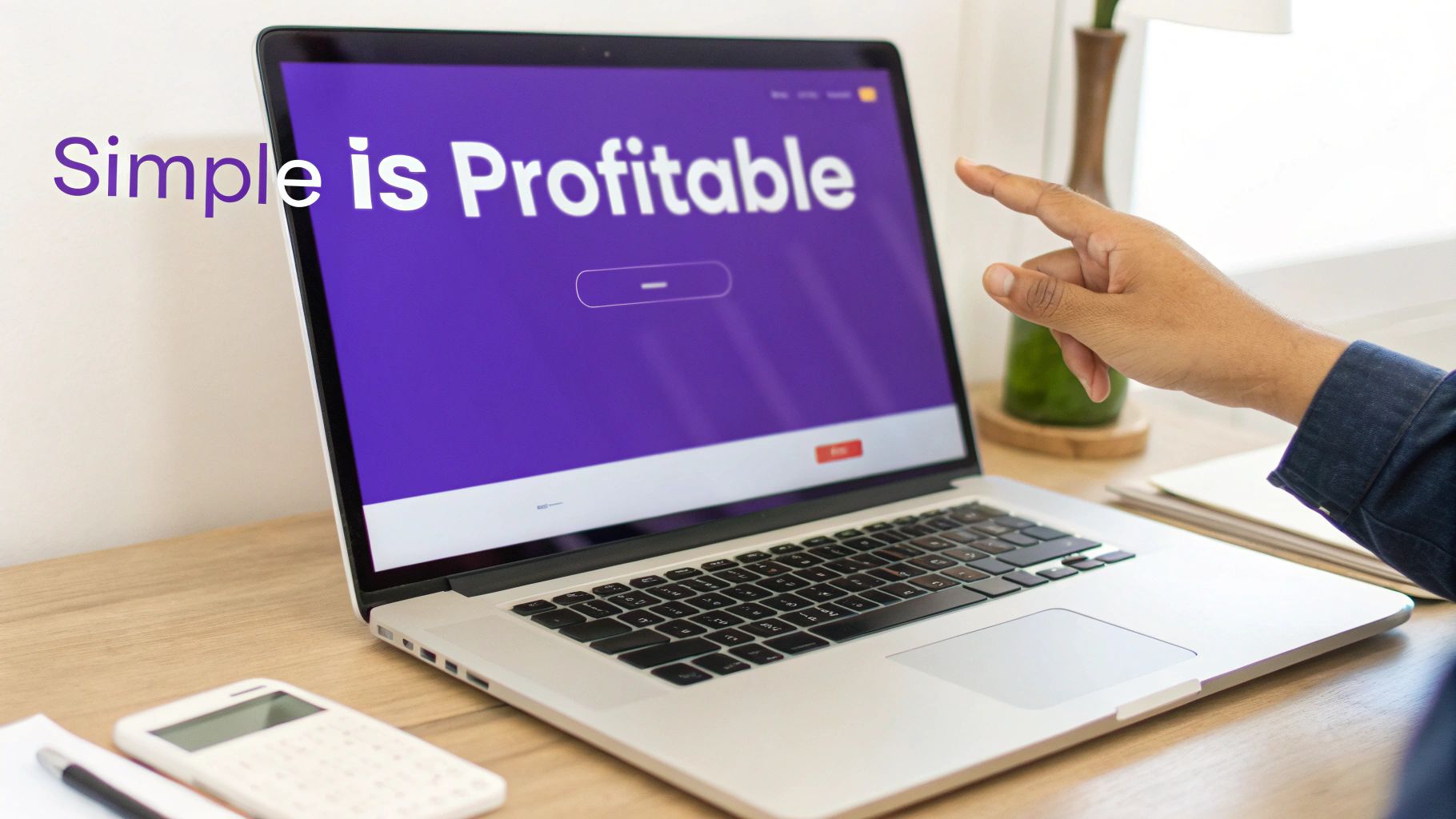
Simple Design Is Profitable Design
Let’s be clear: simple web design is not boring. It's profitable. For marketing leaders and product teams, simplicity is the sharpest tool for lifting conversion rates.
Every unnecessary button, image, or stray line of text adds 'cognitive load'—mental friction that distracts users from the one action you want them to take.
For a tourism operator, that friction means abandoned bookings.
For a SaaS company, it means fewer trial sign-ups.
For a professional services business, it’s a flood of low-quality enquiries from confused prospects.
True simplicity is ruthless clarity. It’s stripping away every distraction to create a smooth, obvious path towards a single, valuable action.
The Real Cost of Complexity
Complex, cluttered websites do more than just look messy—they actively damage your bottom line. User testing and heatmap analysis prove this repeatedly: when people get confused or overwhelmed, they leave.
This isn't a minor UX issue; it's a direct loss of revenue. A simple, conversion-focused design brings the focus back to what drives results:
Absolute Clarity: Can a visitor understand your offer and what to do next within five seconds? If not, you’re losing them.
Focused Navigation: Is the path to booking or enquiring logical and effortless, without confusing detours?
Obvious Calls-to-Action (CTAs): Are key actions like ‘Book Now’ or ‘Get a Quote’ impossible to miss?
Simplicity makes the profitable path the easiest path for your customer. By removing non-essential elements, you make your core value proposition and desired call-to-action stand out, directly increasing the likelihood of conversion.
The table below breaks down the commercial difference. It's not subtle.
Simple vs. Complex Design: Commercial Outcomes
The data is clear: complexity adds friction, and friction kills sales. A large part of this is making your site easy for everyone to use. It’s worth understanding how accessibility boosts UX and sales, because its core principles—clarity, focus, and ease of use—are the same ones that drive profit.
Why Kiwi Customers Demand Simplicity
The preference for simple web design isn't just a global trend; it’s a hard-coded market reality in New Zealand. With near-universal internet access, Kiwis have been conditioned by world-class platforms to expect fast, intuitive digital experiences.
A cluttered, slow-loading site isn't a minor annoyance. It's a primary reason people abandon your site, costing you revenue.
This expectation is sharpest for tourism operators, SaaS companies, and professional service firms. A potential customer lands on your site with the muscle memory of using apps like Instagram or Trade Me. They expect instant clarity and an effortless path to what they need. Anything less feels broken and untrustworthy.
The Mobile-First Reality for NZ Businesses
High mobile usage across New Zealand makes a lightweight, simple website non-negotiable. Assume your audience isn't at a desk; they're browsing on the go, often with patchy regional internet.
Every oversized image and unnecessary script actively works against you, slowing the experience and costing you bookings or leads.
Consider the commercial impact: a Queenstown tour operator’s website that takes eight seconds to load on mobile has almost certainly lost the booking. A Wellington-based SaaS company with a complicated sign-up form creates friction that directly hurts its trial-to-paid conversion rate.
Your website isn’t being judged against your direct competitor. It’s being judged against the last great digital experience your customer had, which was probably on their phone moments ago.
Data-Driven Simplicity
The numbers confirm this—Kiwi consumers have little patience for poor UX. With 96.2% of the population online, nearly every potential customer evaluates your business on the first load and scroll.
Research shows 42% of users will abandon a website due to poor functionality. Another 38% will leave because of an outdated or cluttered design. For a local service business, losing that many potential enquiries each month is a significant commercial blow. You can explore more about New Zealand’s digital landscape on DataReportal.
Simple, focused design isn't an aesthetic choice; it’s a direct response to how New Zealanders actually browse and buy. A complex site actively filters out your most valuable prospects, leaving you with missed revenue opportunities.
The Five Pillars of High-Converting Design
Simple web design isn’t about chasing visual trends. It’s a strategic framework built on five core pillars that directly drive conversions. Get these right, and you stop guessing what might work and start building experiences that predictably generate bookings, leads, and sales.
Each pillar solves a fundamental user problem. Together, they create a frictionless path from first glance to final click, turning your website from a digital brochure into a reliable commercial asset.
User expectations today are shaped by their experiences on major global platforms. They bring those same high standards to your site. This diagram shows how that demand flows directly into the design choices that win or lose you a customer.
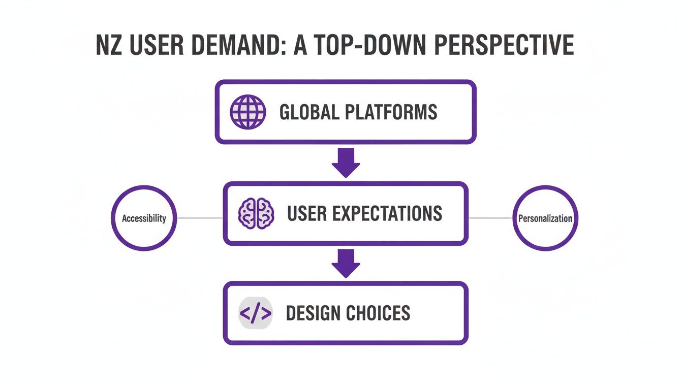
The message is clear: simplicity isn't just a nice-to-have. It’s a baseline expectation, and your website is being judged against the best in the world.
1. Visual Hierarchy
Visual hierarchy controls where the user’s eye goes. It’s the art of using size, colour, contrast, and empty space to tell visitors exactly what to look at first, second, and third. A strong hierarchy makes your most important action—like a "Book Now" or "Get a Quote" button—the most dominant thing on the page. It’s impossible to miss.
A classic mistake is giving every element the same visual weight. This creates noise and forces users to think—a conversion killer. On a SaaS pricing page, for example, the preferred plan should jump out, perhaps with a different background colour or a "Most Popular" banner. That simple visual nudge guides people, reduces indecision, and lifts sign-ups.
2. Absolute Clarity
Clarity means answering three questions in five seconds: What is this? Who is it for? And what do I do next? If your headline, sub-headline, and main call-to-action fail this test, you're leaking revenue.
A professional services firm with a vague headline like "Innovative Business Solutions" talks to no one. A far better version? "Accounting Services for Kiwi Tradies That Save You 5 Hours a Week." It’s specific, benefit-driven, and instantly connects with the right audience. Heatmaps consistently show that users scroll right past vague, fluffy sections, hunting for something concrete.
Your value proposition must be so clear that a visitor can explain it to someone else after only a few seconds on your homepage. Anything less is a conversion leak.
3. Effortless Navigation
Your site’s navigation is its roadmap. If it's complicated, users get lost and leave. Effortless navigation limits choices, uses plain English, and ensures a user is never more than three clicks from their goal.
Many tourism operators list ten different tour types in their main menu, creating confusion. A better approach is to group them into three clear categories like "Adventure," "Family," and "Scenic." Analytics data from a UX audit always reveals that pages buried deep inside complex navigation get almost no traffic or engagement.
4. Blazing Speed
Page speed is a core part of the user experience. A slow site feels unprofessional and disrespects your visitor's time, immediately damaging trust and their desire to buy. For every extra second a page takes to load, conversion rates drop hard.
A booking site for a hotel or tour that loads instantly feels reliable and efficient, reinforcing the decision to book. Understanding these fundamentals is crucial when you are building a website that converts travellers.
5. Focused Calls-to-Action
Your Call-to-Action (CTA) must be singular and obvious. Don't create friction by offering multiple competing CTAs on one page, like "Book a Demo," "Download eBook," and "Watch Video." A simple design identifies the single most valuable action for that page and makes it the only clear choice.
A service page should guide everyone toward one primary goal, like "Request a Consultation." Secondary, lower-commitment actions can exist, but they must be visually secondary. To dig deeper, check out our guide on website conversion rate optimisation.
Common Mistakes That Quietly Kill Conversions
The biggest conversion wins don’t come from adding something new. They come from fixing what’s broken.
Many websites leak revenue from silent conversion killers—seemingly small design choices that create major friction for users. These mistakes often masquerade as "offering choice" or "creative design," but in reality, they just confuse people and sabotage your sales goals.
The Trap of Vague Headlines
A headline is the first thing a user reads; if it’s vague, it’s probably the last. Generic phrases like "Innovative Solutions for Growth" tell someone nothing useful, forcing them to burn mental energy just to figure out what you do. Most won't bother.
Before: A SaaS company’s homepage reads, "Next-Generation Workflow Automation." This jargon speaks to nobody.
After: "We Automate Your Team’s Invoicing in Under 5 Minutes." This is specific, benefit-driven, and crystal clear.
The impact is direct. Vague headlines attract low-quality leads because prospects don't understand your service. Clear headlines bring in qualified leads who know exactly why they’re getting in touch.
Triggering Analysis Paralysis
Offering lots of choice feels helpful, but it often backfires. When a user faces too many options of equal visual weight, they experience analysis paralysis and are more likely to make no choice at all.
Imagine a tourism operator's homepage featuring eight different tour packages, each with its own "Learn More" button. A potential customer lands, is immediately overwhelmed, and leaves.
A simple web design guides the user by making the best choice the most obvious choice. This isn't limiting them; it's helping them.
A better approach is to feature one primary tour—perhaps the "Most Popular"—with a bold "Book Now" button. Other options are still available but presented as secondary choices. This prevents overwhelm and funnels attention towards your most profitable offering, boosting bookings for that featured tour.
Burying The Call-to-Action
Your call-to-action (CTA) is the most important element on any commercial page. If users have to hunt for it, you're losing money. A classic mistake is placing the primary CTA "below the fold," forcing people to scroll before they can take action.
Heatmaps expose this problem constantly. You’ll see a flurry of activity at the top of the page, but engagement plummets before the user ever reaches the button—a dead giveaway that your most crucial element is invisible. The fix is simple: ensure your primary CTA is instantly visible when the page loads. For a professional services firm, this could be the difference between capturing a lead and losing them to a competitor whose "Get a Free Quote" button was impossible to miss.
Diagnosing these issues means looking at your site through your users' eyes. You can learn more about how to find and fix the real conversion killers on your website.
The Financial Case for Keeping Your Website Simple
Let's step away from user experience and talk about cash. A simple web design isn’t just a nice-to-have; it’s a powerful financial lever for your business.
A bloated, complex website is a money pit. It costs more to build, host, and maintain—a massive issue for the small and medium-sized businesses that are the backbone of New Zealand's economy.
Complexity costs you at every stage. Every extra plugin, custom feature, or third-party script piles on development hours and ramps up technical debt. This creates a fragile system where one bad update can grind your bookings or lead generation to a halt, costing you revenue and emergency developer fees.
Lower Overheads, Higher Returns
Committing to simple web design translates directly to a healthier balance sheet. By focusing on core customer needs, you slash both upfront and ongoing expenses.
This lean approach means:
Reduced Build Costs: Fewer templates, simpler code, and less custom development mean a faster, more affordable initial build.
Cheaper Hosting: Lightweight sites need fewer server resources, allowing for more cost-effective hosting plans without sacrificing speed.
Lower Maintenance Fees: With fewer moving parts, there's less to break, update, or secure, dramatically cutting long-term maintenance costs.
Simplicity isn't just an aesthetic choice; it's a financial strategy. It minimises operational risk and frees up cash that can be reinvested into marketing and sales.
The economics are clear in the New Zealand market. Local agencies estimate a basic business website starts around NZ$3,000–$5,000, but complex platforms can easily soar past $50,000. For the 97% of Kiwi businesses that are SMEs, every shiny new feature adds to a constrained budget.
A simple architecture also means troubleshooting is much faster. When a single broken plugin can wipe out a week of bookings for a regional tourism operator, the financial case for simplicity is undeniable. You can get more insights into NZ website development costs from local experts.
Invest in Outcomes, Not Ornaments
Ultimately, a simple website lets you move faster. When your site isn't a tangled mess of code, deploying a new landing page or A/B testing a new offer is a quick, low-risk task. This speed is a huge competitive advantage.
By focusing your budget on a clean, efficient foundation, you shift investment from fighting technical fires to optimising what actually matters. Our guide to user experience optimisation shows how a relentless focus on core user journeys drives commercial results.
Simplicity pays for itself by cutting waste and amplifying the impact of every dollar you spend.
Actionable Steps to Simplify Your Website Today
Enough theory. The next step is to stop thinking and start doing. This isn’t about a massive, expensive redesign. It’s about making small, smart changes that deliver big results in bookings and lead quality. We're going to build momentum with quick, low-cost experiments.
First, Run a Simplicity Audit
Before changing anything, you need to know where the real friction is. A quick UX audit will show you exactly where your site is making life difficult for visitors.
Define Your One Goal: Look at your homepage. What is the single most important action you want someone to take? "Book a Tour," "Start a Trial," or "Request a Quote"? Get specific.
Run the Five-Second Test: Open your homepage for just five seconds, then close it. Can you recall the main headline, what the business does, and where you're supposed to click? If not, you have a clarity problem that's costing you leads.
Find the Leaks in Your Analytics: Log into your analytics platform (like Google Analytics). Check the user flow reports. Where are people bailing? A high exit rate on a key page in your booking or enquiry funnel is a massive red flag. That’s a conversion leak.
Identify and Kill Distractions: Go through your key pages—homepage, main service page, booking form. For every element—image, link, text, button—ask: "Does this directly help the user complete our number one goal?" If the answer is no, it's clutter. Remove it.
Quick Experiments to Run This Week
Now you have a few ideas, run simple A/B tests to get hard data on what works.
Test a Simpler Headline: Is your headline vague? Pit it against a new one that’s ultra-clear and screams the benefit. Watch what happens to your bounce rate and time on page.
Remove a Distracting Sidebar: Most sidebars are graveyards for forgotten links. Heatmaps from a UX audit usually show they get ignored. Try removing it and see if more people click your main call-to-action.
Simplify Your Main Form: If your enquiry form looks like a tax return, you’re losing leads. Test a version with just the essentials: name, email, and a message box. A shorter form almost always gets more submissions.
Your website isn't a static brochure; it’s a dynamic sales tool. The fastest way to improve its performance is through continuous, data-driven simplification.
These small steps clear the path for your customers. They cut friction, build confidence, and make it far easier for people to say yes. But knowing exactly where to start for the biggest commercial impact often requires an expert eye.
Find out where your website is leaking money. Our UX Snapshot uncovers your biggest conversion gaps fast, delivering a clear, prioritised action plan to increase your bookings, sign-ups, or qualified leads.

Subscribe to our newsletter
Stop losing bookings, get insider tips to turn your website into a conversion machine.
More posts
Insights to help you turn more visitors into bookings, through better SEO, UX, and conversion strategy.
Customer journey mapping for bookings and enquiries (practical guide)
Marketing for B2B: A Modern Playbook for High-Growth
How Strategy and Branding Drives Conversions for NZ Businesses