
High traffic means nothing if it doesn't convert. Your landing page might attract visitors, but if it fails to generate bookings, trial sign-ups, or quality leads, it's a direct and preventable hit to your revenue. This guide provides practical, UX-driven insights to fix that.
When a potential customer lands on your page, you have seconds to earn their trust and guide them to act. Subtle UX flaws—a confusing value proposition, a clunky booking calendar—are actively costing you money. These issues create friction, and friction causes potential customers to leave.
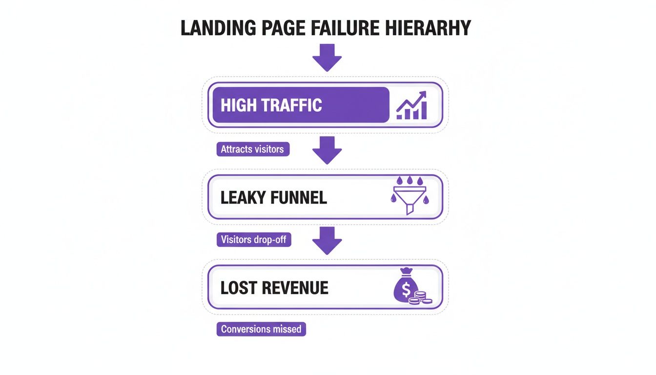
The Real Cost of a Leaky Funnel
A visitor is ready to book your tour, but the payment form is a nightmare on their phone. Gone. A potential SaaS client wants to try your software, but the sign-up process asks for too many details upfront. They're gone, too. Each abandoned cart or incomplete form represents lost income.
This is where Conversion Rate Optimisation (CRO) comes in. It’s the discipline of systematically improving your website to increase the percentage of visitors who take the action you want. By focusing on CRO, you plug the leaks in your conversion funnel and turn more of your marketing spend into revenue.
In New Zealand, where the average website conversion rate is a sobering 2.35%, this is critical. Most of that hard-won traffic is turning into missed opportunities. You can dig deeper into this by reading our analysis on website optimisation in 2025.
How to Diagnose the Real Problem
To understand why users are leaving, you need to move beyond basic analytics. Qualitative data tools like heatmaps and user session recordings are invaluable. They show you exactly where people get stuck, what they click on, and how far they scroll before losing interest. A heatmap provides an instant visual report on user behaviour.
This visual data immediately tells you if your main call-to-action (CTA) is being ignored or if users are repeatedly clicking a non-interactive element, signalling deep frustration. A proper UX audit combines this data with expert analysis to build a prioritised list of fixes that directly impact your bottom line.
A common mistake is investing thousands in driving traffic to a page that isn't optimised for conversions. It's like pouring water into a bucket full of holes. The smarter investment is fixing the bucket first.
Fixing these leaks transforms your landing page from a digital brochure into a powerful conversion tool. It’s about making data-driven decisions that turn traffic into tangible commercial outcomes.
Ready to find out why your visitors aren't converting? Our complimentary UX Snapshot is the fastest way to uncover the hidden conversion gaps on your most important landing pages.
Deconstructing a High-Performing Landing Page
A great landing page doesn't happen by accident; it's an engineered system. The best are built on a solid understanding of user psychology, guiding visitors from interest to action. Every element—from the headline to the CTA—must work in concert towards a single goal. When misaligned, the user's journey breaks down, friction creeps in, and you lose money.
You can drive all the traffic you want, but if the page is a leaky bucket, that investment is wasted.
To build a page that converts, you must ensure each core component effectively moves the user towards your goal.
The Headline and Sub-headline: The First Five Seconds
Your headline has one job: instantly confirm the visitor is in the right place by matching the promise of the ad or link they just clicked. Vague or overly clever headlines create confusion and kill momentum.
A professional services firm’s headline like "Strategic Growth Consulting" is generic fluff. In contrast, "We Help B2B Tech Firms Add $2M in ARR in 12 Months" is specific, benefit-driven, and immediately qualifies the right audience. The sub-headline then builds on that promise, quickly answering the visitor's core question: “What’s in it for me?”
The Hero Section: The Visual Handshake
The hero section—the first screen with your headline and main visual—sets the tone. Your image or video must do more than look professional; it must create an emotional connection and demonstrate the value of your offer.
For a Tourism Operator: Ditch the generic beach photo. Use high-quality video of real guests enjoying your tour. You’re selling the experience, not just the location.
For a SaaS Company: A static dashboard screenshot means nothing to a new user. Instead, use a short, looping GIF that shows the software's "aha!" moment in action. Make the value tangible.
For a Service Business: A photo of your team in a boardroom is uninspired. Feature a high-profile client's logo or a powerful testimonial in the hero section to build instant credibility.
Social Proof: Building Instant Credibility
Before anyone will book, buy, or sign up, they need to trust you. Social proof is the fastest way to build that trust. It’s a third-party endorsement reassuring visitors that others like them have made the right choice by picking you. But social proof must be strategic.
Place your most compelling case study result or client logo directly below the hero section or next to your main CTA. This placement tackles objections head-on when users are sizing you up, lowering their anxiety and making them more confident to proceed.
A common mistake is hiding testimonials on a separate page. For a landing page to convert, proof points must be woven into the main user journey to have any real impact.
The Single, Unmistakable Call-to-Action
Every high-performing landing page has one clear goal, which means it needs one clear, primary CTA. Offering multiple choices—"Book a Demo," "Download Our eBook," "Watch a Video"—creates decision fatigue. The user freezes. It's a classic conversion killer.
Your CTA button must stand out visually, using a colour that contrasts with the page. The text needs to be specific and action-oriented. "Submit" is weak. "Get Your Free Quote" or "Book My Kayak Tour" tells the user exactly what will happen next and reinforces the value they’re getting.
Context also matters. While the average NZ e-commerce landing page converts at 4.2%, this swings wildly by industry. Data from Shopify shows that events and entertainment can hit 12.6%, while high-ticket items over $1,000 often hover near 1%. Know your benchmarks.
Core Landing Page Elements and Their Conversion Impact
By meticulously engineering each element, you create a seamless and persuasive journey. It’s about moving beyond guesswork and using proven principles to turn more visitors into valuable customers.
Struggling to figure out which parts are broken on your own page? Our UX Snapshot is designed to quickly find these conversion gaps and give you a prioritised list of fixes.
Tailoring Your Page for SaaS, Tourism, and Services

Generic advice won't cut it. A high-conversion landing page strategy is dictated by your industry. The mindset of a SaaS buyer is worlds away from someone booking a holiday, meaning the psychological triggers you use must be completely different. A page that works for a software company will fall flat for a tourism operator.
The SaaS Playbook: Demonstrate Value, Fast
For a Software-as-a-Service business, the landing page must show tangible value as quickly as possible. Your visitor is likely comparing other options and has no time to waste. Your goal is to get them to request a demo or start a free trial by proving your software solves their exact pain point better than anyone else.
Interactive Product Tours: Static screenshots are obsolete. Embed a lightweight, interactive demo using a tool like Navattic or Walnut. Letting users click through a key workflow delivers an "aha!" moment, building confidence and improving sign-up quality.
Highlight Key Integrations: Your software doesn't exist in a vacuum. Prominently display logos of tools your product integrates with (e.g., Slack, Salesforce, Google Workspace). This answers a critical question upfront and lowers the perceived friction of adoption.
Pricing Tables That Clarify: Tiers must clearly articulate the value at each level, aimed at specific user personas ('Starter' for small teams, 'Business' for growing companies). A "Most Popular" tag guides decisions and reduces cognitive load, making the choice feel obvious.
Crucial Mistake to Avoid: Hiding your pricing. Forcing a demo to reveal costs creates massive friction and feels untrustworthy. Be upfront to attract qualified leads who are ready to buy.
The Tourism Playbook: Sell the Experience
As a tourism operator, you aren't selling a room or a ticket. You are selling an unforgettable experience. Your landing page must transport the visitor and make booking feel like the exciting first step of their adventure. Emotion and a dead-simple booking process are everything. We cover this in our analysis on why most tourism websites lose bookings in the first 8 seconds.
Immersive Video Hero Sections: Replace static hero images with high-quality video showing real people having the time of their lives. Capture the energy, scenery, and emotion. A drone shot of your location or a close-up of a smiling guest is infinitely more persuasive than text.
Seamless Booking with Real-Time Availability: Your booking engine is where sales are made or lost. It must be mobile-friendly, show live availability clearly, and require minimal steps. A clunky, slow-loading calendar is a guaranteed way to send customers to a competitor.
Leverage Trusted Third-Party Reviews: Don't just rely on curated testimonials. Integrate review widgets from platforms like TripAdvisor or Google. These carry far more weight because they are seen as unbiased, providing powerful social proof at the point of decision.
Crucial Mistake to Avoid: Using generic stock photos. Customers can spot them a mile away, which cheapens your brand and erodes trust. Investing in professional photos and videos of your actual location and guests is one of the highest-ROI marketing decisions you can make.
The Professional Services Playbook: Build Unshakeable Trust
For consultants, agencies, lawyers, and accountants, the landing page has one primary job: build trust and generate qualified leads. Prospects are making high-stakes decisions. Your page must scream expertise, authority, and a proven track record. It’s about leading with proof, not promises.
Structure Compelling Case Studies: Don't just list client logos. Tell a story using the Problem-Solution-Result framework. Clearly state the client's challenge, detail your specific strategies, and—most importantly—quantify the result. "Increased qualified leads by 150% in 6 months" is infinitely more powerful than "improved lead generation."
Showcase Your Team's Expertise: In services, your people are your product. Feature professional headshots and concise bios for key team members. Highlighting their credentials and experience makes your firm feel more human and builds a connection before you've even spoken.
Design Frictionless Lead Forms: Your form is the final hurdle. Only ask for the information you absolutely need to qualify a lead. A long, intimidating form can be replaced with a multi-step version or a direct calendar booking link for those ready to talk now.
Crucial Mistake to Avoid: Relying on vague promises and corporate jargon. Phrases like "strategic solutions" mean nothing. Use clear, direct language that speaks to your client's problems and shows you understand their world. Specificity builds credibility.
Ready to see which of these conversion gaps are costing you money? Our UX Snapshot provides a fast, expert-led analysis to uncover hidden friction points and give you an actionable plan to fix them.
How to Measure Landing Page Performance

You can't optimise what you don't measure. To understand if your landing pages are working, you must move past vanity metrics like page views and dig into data that reflects commercial outcomes. Effective measurement starts by translating business goals into trackable events and establishing a clear performance baseline before you make changes. Without a benchmark, you're flying blind.
Setting Up Meaningful Conversion Goals
First, define what a "conversion" actually means for each page. A SaaS company might track ‘demo requests,’ while a tourism operator needs to see ‘completed bookings.’ In Google Analytics 4 (GA4), set these up as specific conversion events. This moves you from watching traffic to monitoring actions that directly contribute to revenue.
Common conversion goals include:
Form Submissions: Essential for B2B and service lead generation.
Trial Sign-ups: The lifeblood of SaaS product adoption.
Completed Purchases or Bookings: The primary goal for tourism and e-commerce.
Key Document Downloads: For high-consideration purchases (e.g., pricing guides).
When set up correctly, you can answer critical questions like, "Which ad campaign delivers our most valuable customers?" For example, this Google Ads analysis by WebAntler shows that in New Zealand, Google Ads campaigns have an average conversion rate of 8.93%. If your landing page analytics fall far short of that, a broken user experience is likely the cause.
Moving Beyond Numbers with Qualitative Data
Analytics tells you what is happening, but rarely why. To understand the user behaviour behind the numbers, you need qualitative tools. This is where you uncover the hidden friction points killing your conversions. Tools like Hotjar or Microsoft Clarity provide a visual layer of insight.
Heatmaps: Show where users click, move their mouse, and how far they scroll. A heatmap can reveal that your primary CTA is below the average scroll depth, meaning most visitors never see it.
Session Recordings: Watch anonymised recordings of real user sessions to see precisely where they get stuck, hesitate, or show frustration.
'Rage Clicks': Flag areas where users click repeatedly in frustration, usually on an element that looks interactive but isn't. This is a direct signal of a confusing UI.
Combining analytics data with user behaviour insights gives you the full picture. Analytics may show a high drop-off rate on your booking form, but a session recording will show you it’s because the date-picker is broken on mobile.
This detailed insight is a core part of effective user experience optimisation, turning guesswork into a data-driven strategy.
Analysing the Funnel to Pinpoint Drop-Offs
A funnel analysis visualises the step-by-step journey a user takes to convert. Setting this up in your analytics platform is non-negotiable for finding where your page is leaking money.
Imagine a SaaS sign-up process:
User lands on the page.
User enters email and creates a password.
User submits company details.
A funnel report might show 90% of users complete step one, but only 40% get past step two. You instantly know the problem isn't the page copy; it's the sign-up form's complexity. Armed with that knowledge, you can form a testable hypothesis, such as, "Removing the 'company details' field will increase sign-ups by reducing friction."
Essential Landing Page Metrics and The Tools to Track Them
Concentrating on these core metrics builds a solid measurement framework that connects UX issues directly to commercial outcomes. Finding these gaps is the first step; fixing them is how you grow.
A Roadmap for Continuous Optimisation
High-performing landing pages are never 'finished'. The best marketing and product teams treat them not as static documents, but as living assets that constantly evolve based on user behaviour. This iterative approach avoids the dangerous ‘set it and forget it’ mindset and moves you towards a system of continuous improvement where every change is a chance to learn.
This isn't about massive, risky redesigns. It's about making small, intelligent changes, measuring their impact, and letting the wins compound over time. You stop guessing and start systematically learning more about your customers with every test, creating a powerful feedback loop that drives measurable lifts in bookings, leads, and revenue.
The AIPT Testing Cycle: Turning Data Into Action
To structure this process, use the four-step Analyse, Ideate, Prioritise, and Test (AIPT) framework. This cycle turns raw data into profitable action.
Analyse: Start with your data. Use Google Analytics to find pages with high traffic but poor conversion rates. Then, use heatmaps to see what users are actually clicking—or ignoring. A quick UX audit might reveal your mobile CTA is hard to tap, providing an obvious place to start.
Ideate: Based on your analysis, form a clear hypothesis: "Because we observed [data/insight], we believe that changing [element] will result in [desired outcome]." For example: "Because heatmaps show our 'Book a Demo' CTA is being ignored, we believe changing the text to 'Watch a 2-Min Demo' will increase clicks by reducing commitment anxiety."
Prioritise: You will quickly have dozens of ideas. To decide what to tackle first, use a simple framework like ICE (Impact, Confidence, Ease). Score each idea out of 10 for each category. Impact is the potential lift, Confidence is how sure you are it will work, and Ease is how simple it is to implement. The ideas with the highest total scores go to the top of your list.
Test: Implement the change using A/B testing software. Critically, test only one variable at a time. If you change the headline, button colour, and main image simultaneously, you won’t know which change made the difference. Clean data is essential.
Real-World Application
This framework applies directly to SaaS, tourism, and professional services businesses, helping them answer critical questions about what truly motivates their users.
A SaaS Company might test its main CTA. The control could be "Book a Demo" (high commitment). The variation could be "Get a Free Product Tour" (low friction). This test reveals if their audience prefers direct contact or self-guided exploration.
A Tourism Operator could test their hero section. The control might be a beautiful, wide shot of their location. The variation could be a dynamic video showing happy customers enjoying the experience. This directly tests whether emotion and action convert better than static scenery for their market.
Optimisation isn't about finding a 'perfect' page. It's about building a system that continuously refines your understanding of what persuades your audience to act. Every test, win or lose, teaches you something valuable.
By running focused experiments, you build momentum. A 5% lift from a headline test, combined with a 10% lift from a simplified form, quickly adds up to a significant increase in qualified leads or bookings, directly impacting your bottom line.
Tired of guessing what's holding your landing page back? Our UX Snapshot is the fastest way to get an expert analysis of your page. We uncover the conversion gaps and provide a prioritised, actionable roadmap to increase your bookings and leads right away.
Uncover Your Hidden Conversion Gaps
Every day your landing page underperforms, you are leaving money on the table. The subtle UX issues that kill conversions are often invisible to those who see the page every day—you develop blind spots. But to a fresh pair of expert eyes, these conversion barriers are glaringly obvious.
These hidden gaps could be a confusing form field on mobile, a value proposition that doesn't connect with your ideal customer, or a slow-loading payment gateway. Analysing your own work is tough, and it's even harder to see what your competitors are doing right. A detailed competitors analysis from a UX perspective often highlights the features and flows your customers now expect as standard.
The difference between a page that converts at 2% and one that hits 5% is rarely a single flaw. It's usually dozens of small friction points that create a frustrating user experience. It's time to stop guessing and start methodically fixing the leaks in your funnel.
Our UX Snapshot is the fastest, most effective way to identify these hidden conversion barriers without the guesswork.
Get an Actionable Fix List, Fast
We don't just point out problems. We deliver a prioritised, actionable list of fixes built on deep UX and CRO expertise across tourism, SaaS, and professional services. Our experts show you exactly where commercial opportunities are hiding in plain sight, so you can increase bookings, generate higher-quality leads, and drive more revenue.
Ready to find out exactly where you're losing money? Our complimentary UX Snapshot uncovers the hidden conversion gaps on your most important landing page and gives you a clear, actionable plan to fix them. Get Your Free UX Snapshot today.

Subscribe to our newsletter
Stop losing bookings, get insider tips to turn your website into a conversion machine.
More posts
Insights to help you turn more visitors into bookings, through better SEO, UX, and conversion strategy.
Customer journey mapping for bookings and enquiries (practical guide)
Marketing for B2B: A Modern Playbook for High-Growth
How Strategy and Branding Drives Conversions for NZ Businesses