
The ecommerce customer journey is the entire path a customer takes with your business, from vague awareness to loyal advocate. But it's never a straight line. It's a complex, multi-channel reality where most SaaS, tourism, and service businesses quietly leak revenue.
For marketing leaders and product teams, ignoring these leaks means leaving money on the table. Understanding and optimising this journey isn't a fluffy marketing exercise; it's a direct lever for increasing bookings, trial-to-paid conversions, and qualified leads.
Your Customer Journey Is a Revenue Problem
Most websites are built around what the business wants to say, not what a customer needs to accomplish. This disconnect creates friction, causing users to abandon booking funnels, drop out of trial sign-ups, or give up on lead forms halfway through.
Mapping the customer journey from the user's perspective is your most powerful tool for fixing these costly leaks. It’s the difference between a neat internal flowchart and the real, unfiltered diary of a customer's thoughts, frustrations, and "aha!" moments. Getting this right is the foundation of any meaningful conversion rate optimisation.
Why the Linear Funnel Is Obsolete
The old AIDA model—Awareness, Interest, Desire, Action—is a relic. It fails to capture how modern customers behave. Today's path to purchase is fragmented across multiple touchpoints and devices.
The New Zealand ecommerce customer journey is a prime example. It’s increasingly complex, with over 50% of consumers using three to five different channels before making a purchase decision. This reality, highlighted in the latest NZ ecommerce report, demands a seamless, consistent experience, whether a user sees your ad on Instagram, reads a third-party review, or lands on your pricing page. This complexity means generic assumptions won't cut it; you need to dig into real user behaviour to find out why people are dropping off.
A leaky customer journey isn’t a UX issue; it's a direct drain on revenue. Every friction point—a confusing SaaS pricing page, a slow-loading booking calendar, an unclear call-to-action—is a lost sale or a poor-quality lead.
A Commercial Approach to Journey Optimisation
This guide provides a practical, conversion-focused framework for mapping and fixing your customer journey. We'll dissect each stage, pinpoint common UX issues that kill conversions, and provide actionable CRO tactics grounded in real-world results.
The goal is to plug the holes in your funnel and directly improve the metrics that matter:
- For Tourism Operators: Increase completed holiday bookings and slash cart abandonment rates.
- For SaaS Companies: Drive more qualified free trial sign-ups and lift trial-to-paid conversion.
- For Professional Services: Generate a steady stream of high-quality, sales-ready leads from your website.
By using data from analytics, user testing, and heatmaps, you can stop guessing and start making decisions that deliver measurable commercial outcomes.
Breaking Down the Five Stages of the Modern Customer Journey
To optimise your customer journey, you must first understand its structure. Forget the linear funnel; today’s path is a fluid cycle where users can enter, exit, and re-engage at any stage.
Understanding these five phases is the first step to plugging the leaks where you lose conversions and revenue.
This map shows what the modern Kiwi shopper really expects. They move between channels, prefer local, and want you to remember who they are.
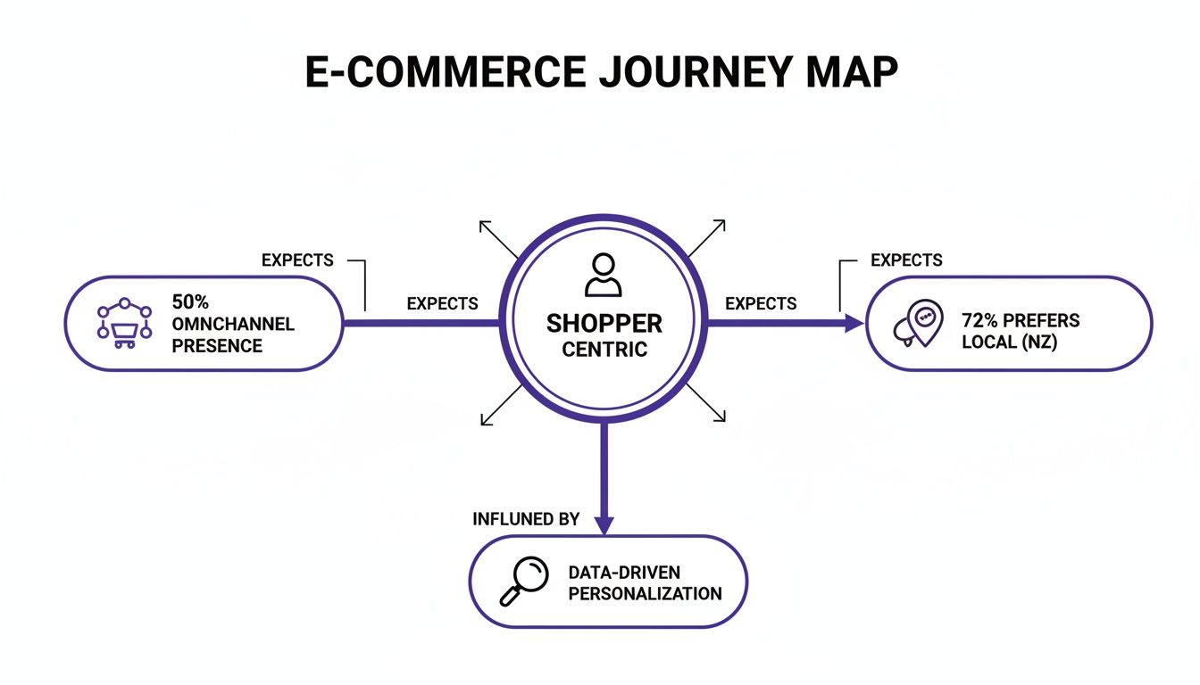
The message is clear: customers encounter your brand everywhere. Your job is to ensure the experience is coherent and seamless, no matter the touchpoint.
Stage 1: Awareness
This is where a potential customer first encounters your brand. They have a problem or a desire but likely don’t know you offer a solution. The goal here isn't to sell; it's to get on their radar by being helpful.
- SaaS Example: A product manager is struggling with missed deadlines. They Google "best tools for agile teams" and find your blog post comparing different methodologies. You're now a potential solution.
- Tourism Example: A couple starts planning a luxury weekend getaway. They see a targeted Instagram ad from a local vineyard showcasing its new accommodation packages. The seed is planted.
A common mistake in UX audits at this stage is a hard sell on informational landing pages. This scares off users who are purely in research mode, immediately damaging trust.
Stage 2: Consideration
Here, the user is actively researching solutions. They know you exist and are now comparing you against competitors. Your website’s job is to provide the specific, detailed information they need to feel confident in their choice.
Clear, easy-to-find information is non-negotiable.
A classic conversion killer in this phase is burying critical details. If a SaaS user has to hunt for pricing or a tourist has to dig for a detailed itinerary, they’ll abandon your site for a competitor who makes it easy. Heatmaps often show users rage-clicking where they expect this information to be.
- Professional Services Example: A marketing director needs a new CRO agency. They are on your website, scrutinising case studies, client testimonials, and service pages to validate your expertise. A vague portfolio or lack of measurable results gets you cut from their shortlist.
- Tourism Example: The couple is now comparing vineyard stays. They're on your website evaluating room types, checking restaurant menus, and scanning reviews from other guests.
Stage 3: Conversion
This is the moment of truth where the user commits. They book the tour, start the free trial, or submit an enquiry. At this final hurdle, the UX must be absolutely frictionless.
Every unnecessary form field, confusing step, or moment of doubt directly increases abandonment rates. User testing your checkout and sign-up flows is essential to find and eliminate these last-minute revenue killers.
- SaaS Example: The product manager clicks "Start Free Trial." The form only asks for a work email and password. The process is so seamless they are inside the product in under 60 seconds.
- Tourism Example: The couple is ready to book. The "Book Now" button is prominent, the calendar is easy to use on mobile, and the payment page displays familiar trust seals like Visa and Stripe, making the transaction feel secure.
Stage 4 & 5: Retention and Advocacy
The journey doesn't end at the payment confirmation. The post-purchase experience is where you convert a one-time customer into a loyal advocate who drives referrals. This phase is about delivering on your promise and nurturing the relationship.
Many businesses neglect this stage, but mastering the ecommerce post-purchase experience is where long-term value is built.
- SaaS Example: The new user receives a concise, value-driven onboarding email sequence that helps them achieve a quick win within the platform. This positive experience accelerates their path to a paid plan and encourages them to recommend the tool internally.
- Professional Services Example: After project completion, the agency provides a detailed performance report and schedules a strategy call to discuss future opportunities, securing a long-term retainer.
To tie this together, let’s look at what your business should focus on at each stage.
Customer Journey Stages and Key Business Actions
This table breaks down user goals and the corresponding business actions required to facilitate them.
This framework forces you to see your website and marketing through your customer’s eyes, building a valuable relationship instead of just a sales funnel.
How to Build a Practical Customer Journey Map
A theoretical journey map looks great on a whiteboard but does nothing for your bottom line. To drive commercial results, your map must be built on a foundation of real user data, not internal assumptions. A practical map is a blueprint for optimisation, showing you exactly where revenue is leaking and why.
This process isn’t about creating a pretty diagram. It’s about gathering actionable intelligence to improve bookings, trial sign-ups, and lead quality. We start with quantitative data to find where the problems are, then use qualitative data to understand why they happen.
Step 1: Start with Analytics to Find the Leaks
Before you can understand the 'why', you must pinpoint where users are abandoning your site. Your analytics platform is the place to start.
Google Analytics Funnel Exploration: Set this up to mirror your primary conversion paths, such as a booking flow or SaaS trial sign-up. It will immediately show you the biggest drop-off points. A 90% drop-off between adding a tour to the cart and reaching the payment page isn't just a data point; it's a five-alarm fire.
Path Exploration Reports: These reports reveal the actual, often chaotic, routes people take. You might discover that prospective clients for your service business bounce between 'Services' and 'About Us' pages multiple times before exiting—a clear signal of unresolved questions or a lack of trust.
This initial analysis gives you a map with red 'X's marking where your conversions are buried.
Step 2: Use UX Tools to Understand the 'Why'
Once you know where users struggle, you need to see the problem through their eyes. Qualitative UX research tools provide visual proof of the friction they experience.
Heatmaps and Session RecordingsTools like Hotjar or Microsoft Clarity let you watch anonymised recordings of real user sessions. Filter these recordings to focus on sessions that ended on your high-drop-off pages.
There is nothing more motivating than watching a session recording of a user repeatedly trying to click on an un-clickable element on your booking form. It transforms the problem from a percentage in a report into a tangible human frustration, creating the urgency needed to implement a fix.
User TestingWhile session recordings show what happened, user testing explains why. By giving real users specific tasks (e.g., "Find and book the 'Adventure Package' for two adults in March"), you hear their thought process aloud. This uncovers insights data alone can't, like whether your pricing is confusing or your main call-to-action is invisible.
Step 3: Define User Personas and Map Their Journey
With solid data, you can create accurate user personas. These are not vague marketing profiles but data-backed archetypes of your key customer segments, each with distinct goals and pain points.
For instance:
- The SaaS Power User: Goal is efficiency. Hunts for advanced features and integrations. Pain point is a clunky interface that slows them down.
- The Family Holiday Planner: Goal is reassurance. Needs child-friendly options, clear pricing, and social proof. Pain point is a lack of detail or a clunky mobile booking process.
Once your personas are defined, map their specific journey. For each stage (Awareness, Consideration, etc.), document their goals, touchpoints, actions, and friction points. This detailed map becomes your strategic guide for all optimisation efforts. To visualise this, exploring essential user flow examples can provide inspiration. It's also critical to benchmark against competitors; our guide on how to conduct a UX competitor analysis shows you how.
This structured approach transforms the ecommerce customer journey from an abstract concept into an actionable tool for driving commercial growth.
Uncovering the Friction Points That Kill Conversions
A seamless customer journey is the result of relentlessly hunting down and eliminating friction. Every point of hesitation, no matter how small, is a potential lost customer and a direct hit to your revenue. This section is your diagnostic checklist for the most costly UX mistakes that turn eager prospects into abandoned carts.
Confusing Pricing and Vague Service Details
Want to lose a potential customer instantly? Make them work to figure out what you sell and how much it costs. This is a conversion killer during the Consideration stage when they are actively comparing you against competitors.
A SaaS pricing table filled with jargon creates uncertainty, directly causing low trial sign-ups. A professional services firm that buries its offerings under generic marketing fluff forces potential clients to guess—they won't bother. A UX audit consistently shows that users need a clear, scannable comparison of what they get at each price point. If they can’t find it in seconds, their confidence evaporates.
Poor Navigation and Information Architecture
Your website’s navigation is the map that guides users. If it's poorly designed, they get lost, frustrated, and leave. The commercial impact is immediate: lost bookings, failed sign-ups, and poor-quality leads.
Common navigation mistakes include:
- Vague Menu Labels: Using clever but unclear terms like "Solutions" instead of "Our Services" causes confusion.
- Hidden Key Pages: Burying "Case Studies" or "Pricing" in a footer menu prevents users from finding the proof they need to convert.
- Illogical Structure: Forcing a user to click through multiple irrelevant pages to find a tour’s departure times is a guaranteed way to lose their booking.
Heatmaps are brilliant for spotting this, providing a visual map of where users click in confusion.
Mobile Experience Failures and Slow Performance
In New Zealand, mobile is the primary channel. A staggering 80% of online shoppers now use their mobile devices. A poor mobile experience is a direct threat to your business. Research shows 53% of mobile visitors will abandon a site if it takes longer than three seconds to load, a statistic detailed in this report on NZ ecommerce trends.
For a tourism operator, this translates directly to lost revenue. Imagine a user trying to book a last-minute tour on their phone, only to face a form requiring endless pinching and zooming. That booking is lost. For SaaS and service businesses, a clunky mobile site destroys credibility before a user sees what you offer.
Every extra second your site takes to load actively costs you money. Unoptimised images and bloated code are the usual suspects, and they directly increase bounce rates while tanking conversions.
Lack of Trust and Weak Calls-to-Action
Trust is the currency of the internet. Without it, no one will provide their email address, let alone their credit card details. A lack of trust signals is a major friction point that quietly sabotages conversions.
These missing signals include:
- Outdated testimonials or no recent reviews.
- No clear contact information or physical address.
- A checkout or lead form that lacks security badges.
Compounding this problem are weak, ambiguous calls-to-action (CTAs). A button labelled "Submit" creates uncertainty. A powerful CTA like "Get Your Free Quote" or "Book Your Tour Now" sets a clear expectation, reduces anxiety, and makes users far more likely to click. To learn more, check our guide on how to stop guessing and fix the real conversion killers.
How to Fix Your Funnel with Actionable CRO Tactics
Identifying friction is half the battle. Now you must fix it with targeted, data-backed Conversion Rate Optimisation (CRO) tactics. Good optimisation is a deliberate process: form a hypothesis based on data, run a controlled test, and measure the impact on your business goals.
Optimising for Awareness and Consideration
In the early stages, your goal is to build trust and demonstrate expertise. Pushing for a sale too early creates resistance. Your CRO efforts here should focus on proving you are the right solution.
A classic mistake is sending traffic from a specific ad to a generic landing page. A user who clicks an ad for "family ski packages in Queenstown" should not land on a page that just says "Your Ultimate Winter Getaway." This disconnect is jarring and causes high bounce rates.
Here are testable ideas for these stages:
- For SaaS: A/B test your landing page headline. Instead of a generic tagline, try an outcome-focused one. Hypothesis: Changing the headline to "Stop Missing Deadlines: The PM Tool for Busy Teams" will resonate better with our target persona and lift free trial sign-ups by 15%.
- For Professional Services: Add a scannable summary with key results (e.g., "Increased qualified leads by 40%") at the top of your case studies. Hypothesis: This will boost engagement from time-poor decision-makers and increase 'Contact Us' form submissions.
- For Tourism Operators: Replace a static PDF itinerary with an interactive map. Hypothesis: This will increase time on page and drive more "Check Availability" clicks.
Driving Action in the Conversion Stage
This is the final hurdle, where the smallest friction has the biggest impact on revenue. Your only goal is to make converting as simple and reassuring as possible.
Consider a typical SaaS sign-up form that asks for ten fields, including company size and phone number. This creates a huge mental burden and kills momentum. Every field you remove will directly improve your conversion rate.
Before: A SaaS trial form asks for Name, Email, Password, Company Name, Company Size, Role, and Phone Number. The conversion rate is 3%.After: The form is stripped back to just Name, Email, and Password. The conversion rate jumps to 7%. That single change more than doubles new leads.
This principle of radical simplification is your most powerful tool. Here are experiments to get you started:
- Simplify Your Forms: Go through your booking engine or lead form and slash every field that isn't essential for the initial transaction.
- Test Your Call-to-Action (CTA): Experiment with button copy, colour, and placement. Changing a passive "Submit" to an action-oriented "Get My Free Quote" clarifies the next step and can significantly lift clicks.
- Amplify Trust Signals: A/B test the placement of security badges, customer testimonials, and payment logos on the checkout page. This calms last-minute anxiety and reduces cart abandonment.
Each tactic tackles a specific psychological barrier. By systematically testing these changes, you stop hoping for conversions and start engineering them. For a deeper dive, read our guide to website conversion rate optimisation.
CRO Experiment Ideas for Key Customer Touchpoints
Optimisation Is a Continuous Loop
Optimising the customer journey isn't a one-off project. It's a continuous cycle of listening to users, observing their behaviour with tools like heatmaps, and constantly testing new hypotheses. This data-driven process ensures your website evolves to meet user needs, turning more visitors into valuable customers.
Measuring Success and Proving ROI
Optimisation is pointless if you can’t measure its impact. Every change to the customer journey must tie directly back to a commercial outcome to prove its return on investment (ROI).
Start by setting up specific conversion goals and funnels in a tool like Google Analytics. This allows you to monitor how changes affect user flow through critical paths and immediately spot improvements or new drop-off points.
Look Beyond the Conversion Rate
The overall conversion rate doesn't tell the whole story. To build a powerful case for investment, track the KPIs that reflect business health.
- For Professional Services: Track lead quality. A UX change that reduces low-quality submissions but increases qualified prospects is a major win.
- For Tourism Operators: Aim to increase the average booking value (ABV). Are your changes encouraging users to add premium extras?
- For SaaS Companies: The ultimate metric is customer lifetime value (LTV). This shows how UX improvements to onboarding impact long-term retention and upgrades.
It’s a classic mistake to fixate on vanity metrics. The real value comes from connecting a specific UX change—like simplifying a booking form—to a tangible commercial outcome, such as a 15% reduction in checkout abandonment and a direct lift in monthly revenue.
By tracking these deeper KPIs, you prove how UX optimisation directly contributes to the bottom line. This data-driven approach shifts UX from a cost centre to a proven revenue driver, making it far easier to secure budget and buy-in for future projects.
Common Questions, Answered
Here are straight answers to common questions about the ecommerce customer journey.
What’s the Difference Between a Customer Journey and a Sales Funnel?
A sales funnel is your business-centric view—a linear model tracking users towards a single purchase. The ecommerce customer journey is the customer's reality—messy, non-linear, and spanning every interaction from first awareness to post-purchase advocacy. A funnel shows you conversion rates; a journey map tells you why those rates are what they are.
What Are the Best Free Tools to Start Journey Mapping?
You don't need a large budget to find powerful insights.
- Google Analytics: The Funnel and Path Exploration reports tell you where the leaks are in your conversion process.
- Microsoft Clarity or Hotjar: Both offer free plans with heatmaps and session recordings to show you how users behave and where they get stuck.
- Miro or a Spreadsheet: Use a simple tool to map out the stages, user goals, touchpoints, and pain points you've identified.
How Often Should We Update Our Customer Journey Map?
Your journey map is a living document. Review it at least annually or whenever you launch a new service, redesign your website, or see a significant change in conversion patterns. If a key metric suddenly drops, revisit the map immediately—it’s a clear sign that user behaviour or expectations have shifted.
Ready to stop guessing where your website is leaking money? Our UX Snapshot service uncovers the conversion gaps in your customer journey fast, giving you a clear, actionable plan to increase your bookings, leads, and sales.

Subscribe to our newsletter
Stop losing bookings, get insider tips to turn your website into a conversion machine.
More posts
Insights to help you turn more visitors into bookings, through better SEO, UX, and conversion strategy.
Customer journey mapping for bookings and enquiries (practical guide)

Marketing for B2B: A Modern Playbook for High-Growth
How Strategy and Branding Drives Conversions for NZ Businesses